Showing posts with label architecture. Show all posts

Wednesday, May 19, 2010

THE MUSEUM OF AGRICULTURE, CULIACÁN


Our friends from a10studio, with offices in Cabo San Lucas and Mexico City, has sent us an exciting news about their recent work. It's a project they did for The Museum of Agriculture in Culiacán, Sinaloa, Mexico.

Agricultural production is one of the most internationally recognized emblems of Mexico, and particularly of the State of Sinaloa. The state of Sinaloa is known as the "granary of Mexico" because it is the producer of a big variety of food. Its efficient fields have become national leaders in their yields.

Because the economy of Sinaloa is sustained by its agricultural activities, the project seeks to recognize it and promote it, through a work that displays objects related to branches of technology, history of agriculture and agronomy as well as agricultural ways which sustain the economy of Sinaloa. Through the creation of the Museum of Agriculture the city government tries to allow the public to learn more about the forms of production in the locality, while recognizing both the agricultural practice as such, and those who make possible such a noble activity.


Project Brief

Intro:

Through agriculture, man has colonized the territory for centuries, creating irrigation systems and by planting with geometric laws. He has de-naturalized the natural areas through the planting of natural elements; the distance that is between the planted trees or plants depends on both the size of the crop itself as the collection systems used. Each plantation produces a texture and color over the territory.


Agriculture industrializes, the landscape urbanizes.

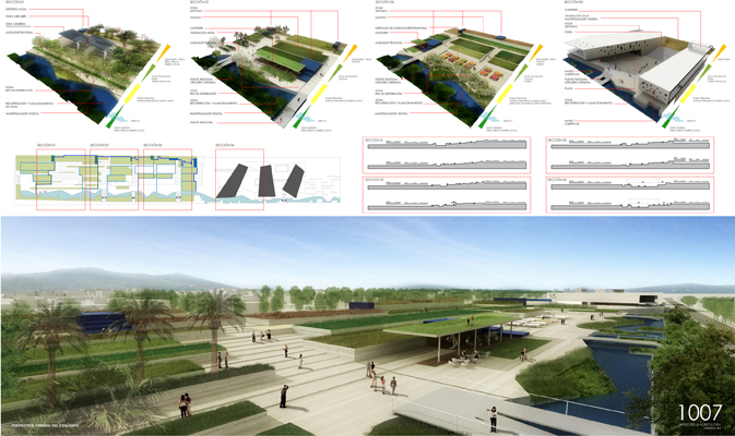
a10studio proposal's outside is as important as the inside. There are no objects and an external reality, but a continuum between forms that wrap and un-wrap, that close and open, that focus and serve as a focus. The architecture as this, expanded in reality, in the middle, through the environment, is an extension. The environment in which it appears is a field.

They present 3 key strategies for the development of the project:

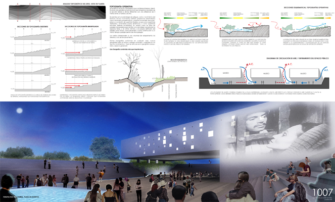
_Operative Topographies

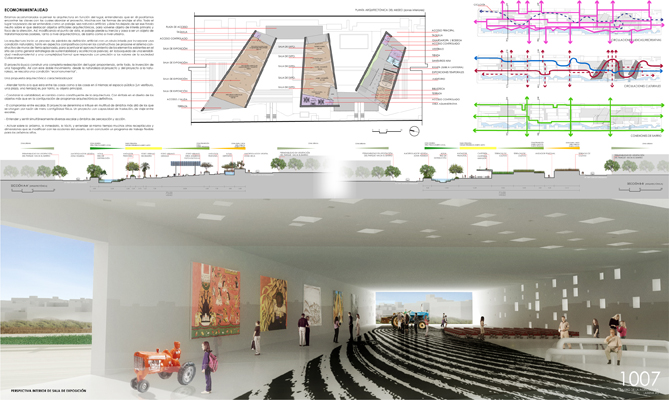
_Ecomonumentality

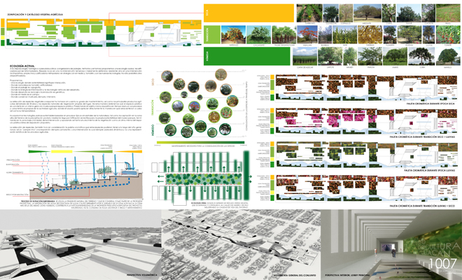
_Active Ecology

The spectacle of nature and city become now comparable.


_OPERATIVE TOPOGRAPHIES:

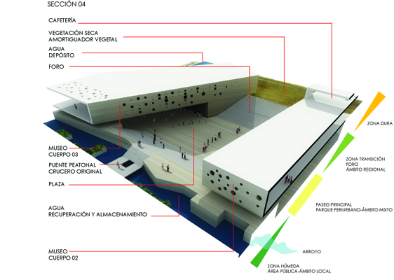
Based on the topographic analysis of the site, we suggests a strategy of folding, cutting and movement of the territory. Such movements define platforms developed as programmatic scenarios, functional plateaus exacerbating their flexible surface condition, either as slipped and extended surfaces [dynamic soil], or as extruded surfaces [located reliefs]. In both cases it is manipulated landscapes that refer to the nature of vacant spaces, and ultimately, the very definition of landscape as a background, as construction and stage at the same time: landscapes within landscapes.

The ground respond to a willingness to overlap, the reliefs to an interlock.

These topographies form in any case, new geographies on the ground; mineral and vegetal landscapes in which the movements and flows are articulated by a manipulated geography and a generated space.


_ECOMONUMENTALITY:

We are used to think of architecture in function of the place, meaning that it could find the keys with which to tackle the project. There are many ways to anchor to the site. The whole place has gone from being understood as a landscape, whether natural or artificial, and it has ceased to be the neutral ground on which man-made architectural objects stand out, to become the object of primary interest and focus of attention. Thus, changing the point of view, the landscape loses its momentum and becomes an object of possible transformations, both at the architectural level, neighborhood and city-level.

The architecture starts a process of artificial blurring with an obvious interest in incorporating a natural condition, both in terms of composition as constructive (proposed construction system of rammed earth walls, to emphasize the use of existing assets in the site as well as develop strategies for sustainability and passive ecotechniques), in search for environmental sensitivity and a formal complexity that responds precisely to the values of the Culiacan society.

The project seeks to build a complete redefinition of the place, offering primarily the invention of a topography. So with this double movement, from the nature to the project and from the project to nature, we seek to rescue a "ecomonumental” condition.
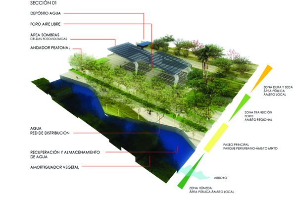


An architectural proposal characterized by:

- Address both what is between things as things in themselves: public space [a hall, a plaza, a terrace] is therefore the primary object.

- The identification of the variability, the change as a key ingredient of architecture. With emphasis on the design of objects rather than the definition of definitive architectural programs.

- The commitment between scales. The project its determined and affects many areas beyond those granted by reason of mere physical contiguity. A project with translation capability, traveling between scales.

- Understand and feel simultaneously different scales and fields of perception and action.

- Acting on the near, immediate, tactile, and understand at the same time many other receptacles and dimensions that get modified with user actions, it is a flexible work program for the upcoming years.

_ACTIVE ECOLOGY:

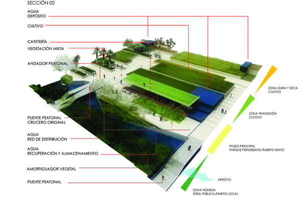
To the old nostalgic or pseudobucolic ecology (freezing landscapes, territories and environments) we propose a bold ecology; reclassified to be reformulated. Based not in a fearful and non-intervention purely defensive -resistant- but in a no-tax, projective and rating -(re)promotive- intervention in synergy with the environment and also with new technologies. Not only possibilities but (re)positivist.

a10studio proposes:

- An ecology where sustainability means interaction.

- Where Nature is is also artificiality.

- Where the landscape is topography.

- Where energy is information and technology the vehicle to development.

- Where development is recycling and evolution is genetic.

- Where environment is the field.

Where retain involve always intervene.

The selection of vegetal species to exhibit took into account the degree of maintenance as well as the main agricultural products of the state of Sinaloa and the natural species of native vegetation. In this way we achieve that public space becomes in a same gesture an inside museum-park-public space. Presenting the exhibiting object in real time with their processes and characteristics of agricultural activity, where the user can directly see how these are conducted and its temporality. Species selection also took into consideration the color palette that these species may have throughout the year generating a "living park" an ever-changing exhibition and intervention which always seem dynamic and not static representation of agricultural processes.


PROJECT DATA:

architectural project: a10studio + lab07

project team: Mariano Arias-Diez, Luis Alarcón, Carlos Marín, Hugo Sánchez, Mia Modak

type: institutional, museum and park

location: Culiacan, Sinaloa (Mexico)

area: 45,000 m2

project year: 2010

client: Instituto Municipal de Planeacion (IMPLAN) de Culiacan

status: Competition finalist

CONSULTANTS:

landscape architecture: Hugo Sánchez / ENTORNO taller de paisaje

structural engineer: Ing. Fernando Alvarez / Construcciones FASA

rendering and digital visualization: Carlos Marín / lab07

lighting design: a10studio

contact a10studio:

_Sierra Guadarrama 85-1, Col. Lomas de Chapultepec, Mexico .D.F 11000, Mexico

_Isla Santa Catarina, Cabo San Lucas, B.C.S., Mexico

tel. +(55)26.23.26.73, +(624)13.15.14.7

email: info@a10studio.net

web: http://www.a10studio.net

Check out the story boards. We love how the thought has been put to every single detail:


Congratulations!

Thursday, May 13, 2010

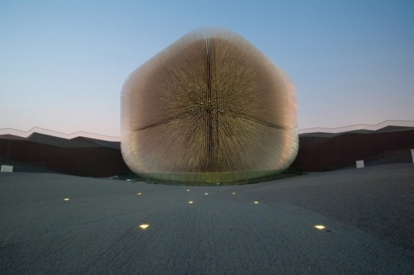
BETTER CITY, BETTER LIFE - Shanghai Expo 2010, UK Pavilion


We absolutely love the UK Pavilion at the Shanghai Expo 2010. Mastermind behind it is Heatherwick Studios, run by acclaimed architect Thomas Heatherwick.

The Pavilion's design seeks to engage meaningfully with the Expo's theme, "Better City, Better Life". It veers from the expected trend of digitally-driven pavilions and explores the relationship between nature and cities. The Pavilion is made up of two interlinked elements, the Seed Cathedral and a multilayered landscape covering 6,000 square meters.


The cathedral itself is 20 meters high and is formed from 60,000 7.5 meter-long transparent fiber optic rods, which draw light into the interior by day and at night become illuminated via inside light sources. The rods, or "optic hairs," also sway in response to the wind to bring dynamism to the structure. The overall design riffs off the mission of London's Kew Garden Millennium Seedbank, which seeks to collect the seeds of 25% of the world's plant species by 2020. It sits on a multilayered landscape continues the cathedral's texture, covering 6,000 square meters. Made of a special artificial grass, it is intended to be a welcoming and restful space for Expo visitors.


Heatherwick Studios won the British Foreign & Commonwealth Office's commission to create the Pavilion, besting other top name competitors like Zaha Hadid Architects, John McAslan + Partners, Marks Barfield Architects, Avery Associates, and DRAW Architects with dcmstudios.


Shanghai Expo runs from May 1 to October 31, 2010. See also our article on EXPO 67.

See the video. It lasts 10 mins, but it's worth it!
Thursday, May 6, 2010

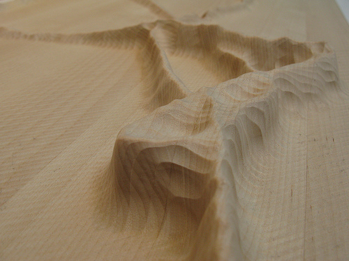
Windcuts

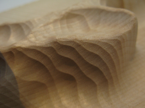
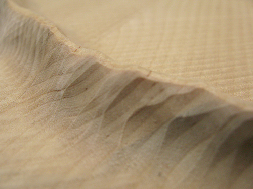
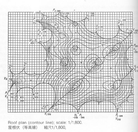
Windcuts [flickr.com] consists of various experiments that turn quantitative sensor data into visually compelling physical instantiations. Wind movement measurement data, such as wind direction, velocity and temperature, was used as the foundation to generate a 3D form, which was then physically drilled out of a piece of wood.

The direction of the physical line corresponds with the direction of the wind. The width and speed of movement reflects the wind speed. The temperature is mapped unto the height. The materials ‘surface plateau’ height represents zero degrees Celsius. So when the shape dips below the surface, it means the wind’s below zero degrees.


Images and articles first seen on el conTEXTO

Sunday, February 28, 2010


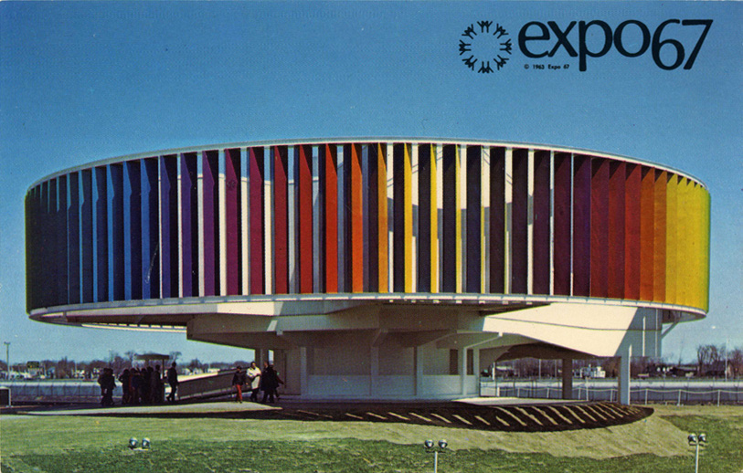
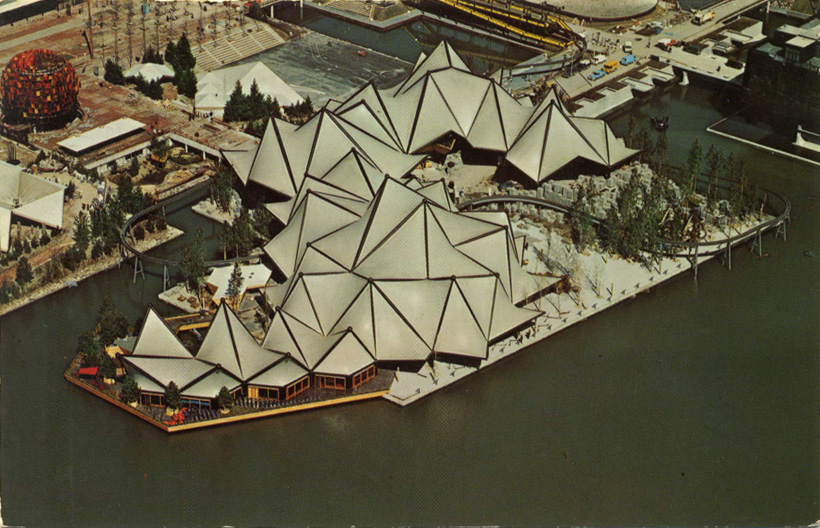
There have been two approaches to designing world's fair architecture. One was to dictate the overall architectural style of the buildings like that of the 1893 World Columbian Exposition. The other was to allow pavilion architects free reign in their creative design. Expo 67 officials decided to allow free reign in architectural style as long as participant's pavilions fit in with the overall loose theme "Man and his World."

By the time Expo 67 was conceived, city architecture had become quite conservative and filled our cities with economical, predictable tall boxy buildings. It was exactly the unexciting style that the business society welcomed, but the effect was boring and it deprived cities a sense of identity. This same design philosophy proved expensive in large apartment buildings and public housing projects. Worse they robbed the individual or family, who lived there, a sense of identity they had when they lived in individual homes with gardens, porches and yards.

Architects of social consciousness were thinking of solutions to cover more space with less material and for less money in ways that didn't rob the individual of his identity. At the same time these architects wanted to make a creative statement. So when participating countries held architectural competitions for their country's pavilions, some unusual architecture evolved.

Perhaps the most innovative concept to be used at Expo was "space- frame" architecture. In an effort to "Do more with Less" architects covered large spaces cheaply and flexibly, by distributing the building's weight over a wide area, and by using complex techniques involving aluminum, plastic and other materials. The pavilions that used that technique were the United States pavilion, the Netherlands pavilion, the West German pavilion and the two big theme complexes, Man the Producer and Man the Explorer.

NETHERLANDS PAVILION

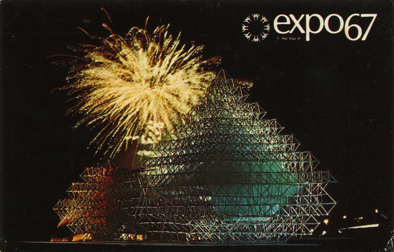
The Netherlands pavilion was an engineering triumph, a space frame structure consisting of 33 miles (57,000 pieces , each three feet long) of aluminum tubing. They didn't weld or rivet the pieces together, rather it was put together like a Gilbert Erector set, with wrenches. The exhibition room was suspended inside. The technique had its advantages in that if the building needed to expand, the builders could just add more pieces. It was a very flexible approach to building design and gave the structure a feeling of lightness.
The Dutch designed a "space-frame" building out of 57,000 pieces of aluminum tubing.


GERMANY PAVILION

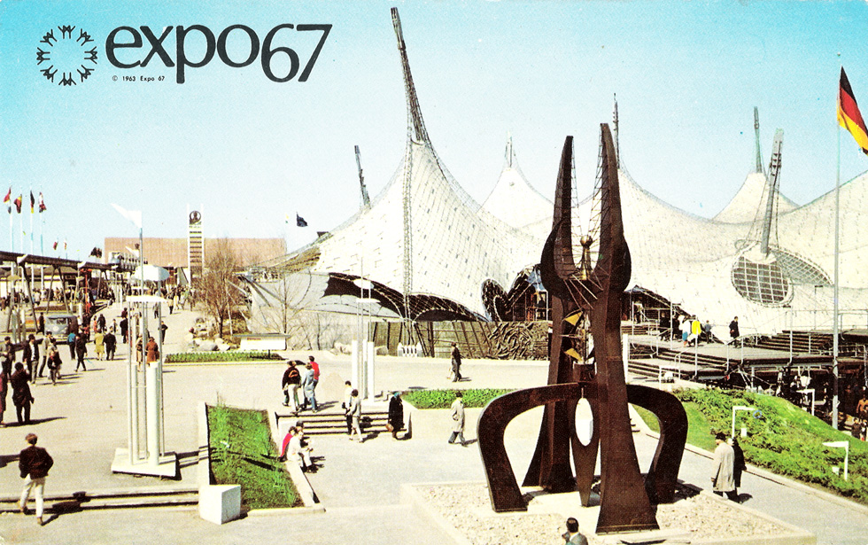
Frei Otto's elegant space frame tent was used to cover the German pavilion's exhibit area. While it took the architect several years to develop his system, it only took six weeks to build. His system used a roof of steel mesh suspended from eight slender steel masts of varied height, situated at irregularly intervals and supported by steel cables anchored outside the structure, covered an area the size of a city block. The roof's steel mesh net, hung from the guy wires, was then covered by a translucent plastic skin. The tent itself and all of its components were fabricated in Germany.
The German Pavilion was covered with a modernistic tent.

The structure adequately dealt with the twin problems of aesthetics and economics. At the least it was a fanciful way of escaping from the tyranny of the box, but it also produced a unique and beautiful interior space. The space below was lit through the transparent plastic and through odd-shaped windows in the roof. As to cost, the building wasn't cheap to build since it was a one of a kind project. But it had potential for its steel and plastic roof weighed only 150 tons; one third to one fifth the weight of normal roofing materials. The tent concept had the ability to adapt to irregular topography of any site. The concept was used again with a much larger tent to enclose the swimming stadium at Munich's 1972 Summer Olympics.

UNITED STATES PAVILION
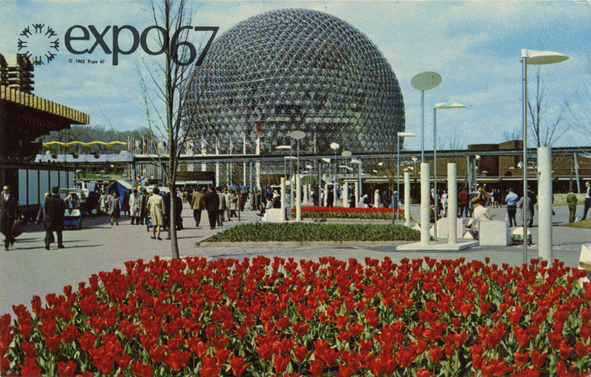
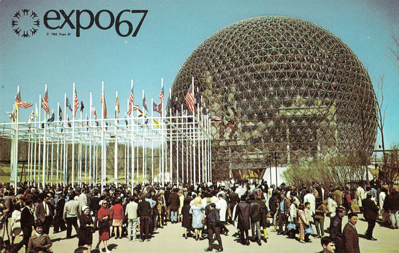
The United States pavilion's designers choose a Buckminster Fuller dome, two hundred feet high (20 stories) and 250 feet in diameter. As in all of Fuller's domes both little and big, they used three- dimensional units, a triangle on the outside, hexagonal on the inside, and curved to fit a given arc, as its structural basis. By connecting them together in the shape of a dome, it distributed the structure's weight over the whole surface. To avoid his usual half-dome that produced a squat look, the pavilion's designers built a beautifully proportioned, three-quarter sphere that fit the site ideally.
The United States Pavilion was a Buckminster Fuller dome.

It was the most complicated of his domes. It used an elaborate system of retractable shading screens to control the heat within. A computer adjusted the screens in accordance with the sun's rays. Its exterior covering was exquisitely tinted, and surprisingly it was lovely to look at.


MAN THE EXPLORER & MAN THE PRODUCER

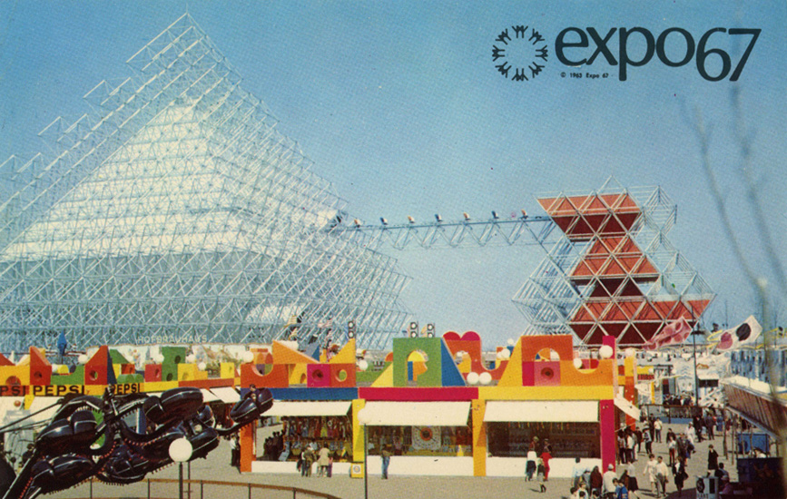
The architects (the firm of Affleck, Desbarets, Dimakopoulos, Lebensold and Sise) of the theme complexes were faced with the need to produce, quickly, some large buildings with large areas of open spaces. They decided to make them out of a type of small building blocks, much in the way the Dutch constructed their pavilion out of short metal tubes. The Canadian architects choose the truncated tetrahedron shape,- a four-sided triangular figure with the corners cut off, then flattened so that it looked like a prism. Thousands of these blocks would "nest" with other blocks, large and small, and be built up quickly into theme pavilions.
Several of the Theme pavilions used "space-frame" architecture to create large inexpensive display spaces.

The designs and models looked graceful, but the steel fabricators complained that there weren't enough welders in Canada to make the truncated tetrahedrons the architects would need. As a result, the units were bolted together and the pieces heavily braced. The final result was at all graceful, but was heavy and oppressive - miles and miles of thick rusted metal.


OTHER NOTEWORTHY PAVILION ARCHITECTURE

Both the Japanese and Man the Community pavilions used static forms composed of alternating crossing beams. The difference in their shapes was in the positioning of those basic structural elements. In the Japanese Pavilion, vertical stacking created a series of interconnecting cubes, but it closely resembled a concrete but graceful log cabin. On the other hand, the profile of Man in the Community resembled a Chaldean ziggurat. The wooden beams were placed so that the formed wooden polygons that rose in decreasing size from foot to summit.
Man the Community Pavilion

The Soviet Unions' Pavilion, by using great walls of glass and aluminum topped by a ski-jump roof, was a departure from its traditional monolithic architectural style. The escalator that lead up into the pavilion prepared the visitor for the surprise of the wide-angled V beams that supported its upswept roof, and carried him into a symmetrically organized display area dominated by a huge bust of Lenin. Inside was a show of technology and the progress of the country's space program.

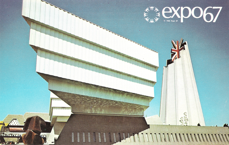
Britain's was a ponderous castle-like pavilion, whose walls, while made of a kind of cardboard, looked like stone. The jagged top of its 200 foot tall cone-like tower topped by a Pop Art version of the Union Jack, represented incomplete construction. It symbolized Britain's unfinished contribution to the world. Fortunately the exhibits inside were very uplifting as the British made an attempt to charm the visitor.


The French Pavilion, on the other hand, modeled itself on the fine art of sculpture. While it was tastefully executed, architectural critics perceived its fins as merely tacked on. In the great well of the building, the floors full of exhibits were arranged around an open space. Its arrangement of interior stairways and balconies, which gave it an airy feel, was often overshadowed their attempt to overwhelm the visitor with technical displays

Austria's pavilion used the space-frame concept to a certain degree. It used triangular building units to construct large habitable cells. The result was a striking exterior architectural form, geometrical in style, that worked well as interior exhibit space.

HABITAT 67

Habitat 67, an experiment in apartment living, became the permanent symbol of Expo 67 after it closed. It was Canadian architect Moshe Safdie's experiment to make a fundamentally better and cheaper housing for the masses. He attempted to make a revolution in the way homes were built - by the industrialization of the building process; essentially factory mass production. He felt that it was more efficient to make buildings in factories and deliver them prefabricated to the site.

Safdie was dissatisfied with both suburbia, which destroyed open space surrounding cities and cut off people's enjoyment of the amenities of city life, and with the high-rise apartment block, which concentrated people on less land. Apartments generally were too small for growing families, and lacked both privacy and outdoor space. He was convinced the later were inadequate as family housing.

He planned Habitat with the goal to find a way to put a great many people on a small space, yet provide them with at least some of the pleasures of a private home. He wanted to build a city in the sky, a 3- D city and his city would contain 1000 housing units, with shops and even a school. What he proposed was an experiment, not just in housing, but in community life.

But between 1964 and 1966 when construction started, it was downsized to only 158 dwelling units, without shops and a school. What started out as a plan for a small city, instead became a hugely expensive apartment building. Worse, while it was on Expo 67 grounds, when Expo 67 closed, it would be some distance from the rest of Montreal's business and housing neighborhoods.
Habitat's 158 living units resembled a Taos Indian pueblo.

As Habitat was designed, it resembled a curious concrete mountain of dwelling places, strikingly modern, yet reminiscent of a Taos Indian pueblo village, or an Italian hill town. Its units were built on the ground, then hoisted by crane into place five, six or more stories above the ground.

A factory was built beside the Habitat site. It contained four large molds in which the standardized units were made. To make each of them, a reinforcing steel cage was placed inside the mold, then concrete was poured around the cage. After the concrete cured, the unit was moved to an assembly line where a wooden sub-floor was installed with electrical and mechanical services below it. Windows and insulation were then inserted; afterwards prefabricated bathrooms and kitchen modules. Finally the unit was moved to its position in the building.

There were 354 of these units in all. But it was the way they were put together than produced the variety of forms that made Habitat, both inside and outside, so unusual. The units were arranged to provide fifteen different types of "houses". These varied from one-bedroom houses (600 sq. feet) to four-bedroom houses (1,700 sq. feet). Each had a private open garden space, 37 x 17 feet. Each man's roof was another man's garden. The arrangement of the units provided privacy and the variation in house layouts provides a sense of uniqueness.

While factory production techniques should have cut overall costs, building 158 apartments isn't really productive in factory work since there is often a steep learning curve. Also since the individual units would bear the weight load of the units above, the units on the bottom where actually thicker and stronger. In the end Habitat 67 cost $22,195,920, or about $140,000 per living unit. Effectively that was the same cost as building six-eight ordinary town houses. Luckily one could rationalize that it was only a prototype, and if scaled up, it might be much cheaper to construct.

While the visiting public was impressed, they didn't embrace the concept. At a distance the complex looked like an exciting piece of Cubist sculpture, at close up it's flat concrete-gray exterior looked boring and as if nobody lived there. Inside the complex Safdie's plastic covered pedestrian streets, connecting the apartments with the elevators and parking lots, were poorly sheltered from Montreal's cold window weather. Perhaps if it had been built near one of Montreal's exciting neighborhoods, the public might have been more willing to accept it, but then few of Expo's fifty million visitors would have seen the innovative housing site.

More images of the Expo:
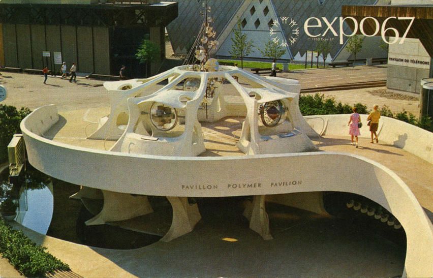
The polymer Pavilion

La Ronde

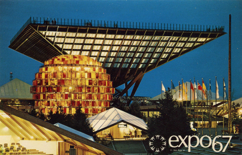
Canada Pavilion

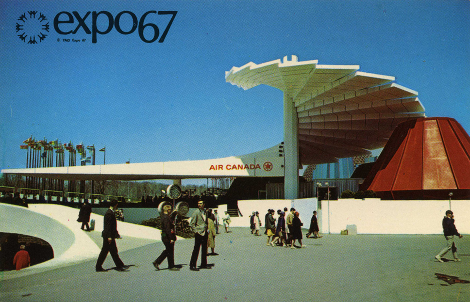
Air Canada Pavilion

Thursday, February 11, 2010

BLOOMFRAME


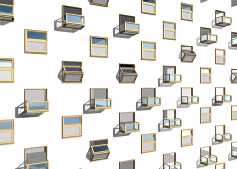
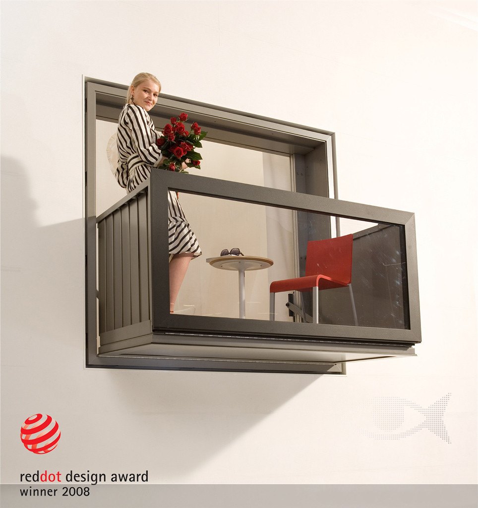
The revolutionary balcony Bloomframe is designed and patented by Hofman Dujardin Architects based in Amsterdam The Netherlands. The Research & Development department from Hurks geveltechniek based in Veldhoven The Netherlands turned the design concept into a spectacular functional prototype.

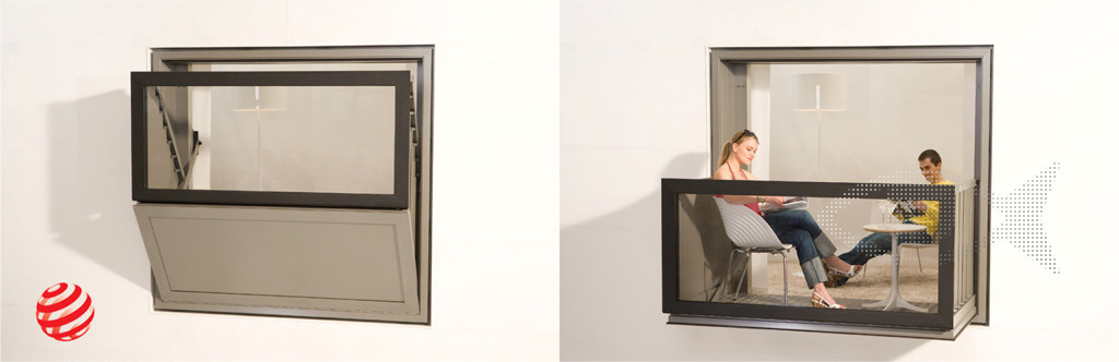
The dynamic balcony offers a solution for compact apartments in dense urban areas. By transforming the elevation into a horizontal surface an outdoor terrace is added to an apartment. Bloomframe can play a significant role in the real estate property of the future.

 
The Bloomframe window can be used in various surroundings. Apartments for students can be easily equipped with an outdoor space. Hotels can add luxurious terraces to their rooms. In large scale renovations of former warehouses balcony's can be created by adding Bloomframe windows to the building. Complex constructions of balcony's or loggias are not longer the only option.
With one push on a button the balcony opens smoothly within 15 seconds. On the few square meters which are generated two persons can enjoy breakfast in the open air. Although the construction is extremely solid, the balcony looks elegant and transparent. During the development of the prototype safety had the highest priority. The upcoming months the development process continues. The final product is expected to be presented at the end of this year. Bloomframe is a registered trademark.


CHECK THE VIDEO!!

Tuesday, February 2, 2010

a10studio at restaurant & bar design awards


Today we're very proud to share the joy with our friends at a10studio, as they are the only Mexican Architecture/Design/Interior firm to be nominated in this year’s Restaurant & Bar Design Awards.

Totally independent, the Restaurant & Bar Design Awards, now in it’s second year, is the only concept of its kind dedicated exclusively to design.

Judged by a highly influential panel of top international journalists from the design, hospitality and lifestyle sectors, the judges will recognise and reward both ‘restaurants and bars’ and their ‘designers’ for design excellence. With online entry and a wide variety of categories, applicants and their projects receive extensive exposure.

The Restaurant & Bar Design Awards have rapidly established a distinguished following, attracting submissions from such high profile designers as Zaha Hadid, Karim Rashid, Kengo Kuma and David Collins in its first year.

Culminating in a unique and innovative awards ceremony, the Restaurant & Bar Design Awards’ winners, including the best designed restaurant and the best designed bar, will be announced and presented with their awards at Westfield Stratford in June 2010.


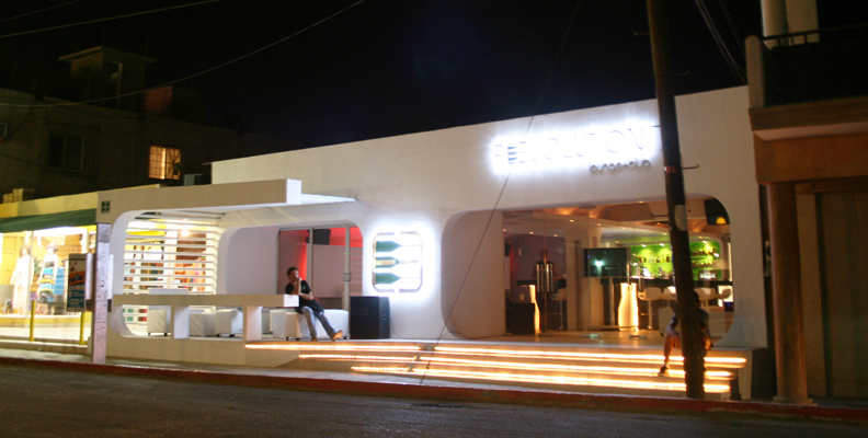
Re*evolution Lounge is the project by a10studio nominated to this year awards, we hope to bring you more good news on this soon.

At the end we're also proud to mention that LA76 participated as a photographer in Re*evolution Lounge project.

More about a10 studio and their work on their website: www.a10studio.net , blog: a10studio.tumblr.com , and Twitter: @a10studio.

Saturday, January 16, 2010

Wallpaper* Design Awards 2010


Wallpaper* just published the winners of their 2010 Design Awards. Entries come from every possible part of the design field, from architecture to fashion design to industrial design, and were awarded in 66 respective categories. A panel of judges, including icons like architect Steven Holl, fashion designer John Galliano, and interior designer Kelly Wearstler, then picked the winners for eleven key awards.

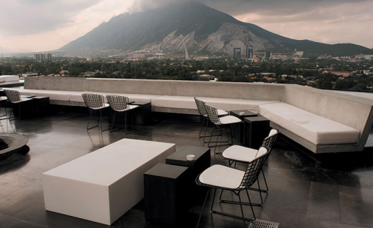
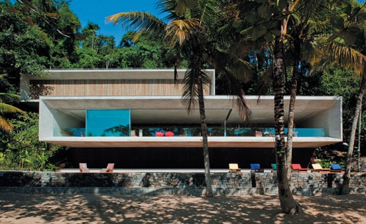
In the category “Best New Private House”, Marcio Kogan’s Paraty House in Costa Verde, Brazil was awarded as winner, and “Best New Public Building” is Koncerthuset in Copenhagen, Denmark by Atelier Jean Nouvel, as also in the Best New Hotel category the award was for Habita MTY by Joseph Dirand and Landa Arquitectos (shown above).

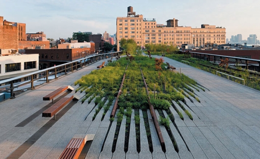
“Best City” this year is - surprise, surprise! - New York whose High Line project was also awarded “Best Life-Enhancer of the Year”.

Here’s a selection of lucky 2010 Design Awards winners (for the complete list of winners please go to Wallpaper.com):


Best City: New York (Video: “City short: New York” by David Usui)


Life-enhancer of the year: The High Line, by Friends of the High Line, James Corner Field Operations and Diller Scofido + Renfro


Best new private house: Paraty House, Costa Verde, Brazil, by Marcio Kogan


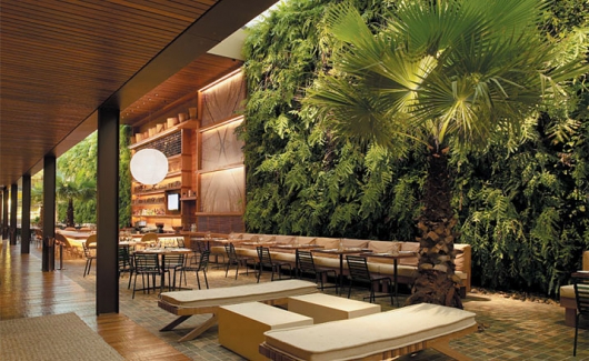
Best new restaurant: Kaa, Sao Paulo, Brazil, by Studio Arthur Casas

as seen on BUSTLER

Thursday, January 7, 2010

ARCHITECTURE OF DENSITY


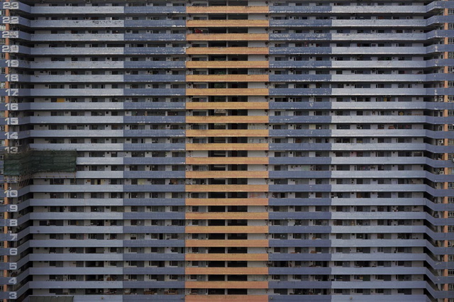
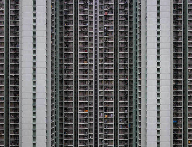
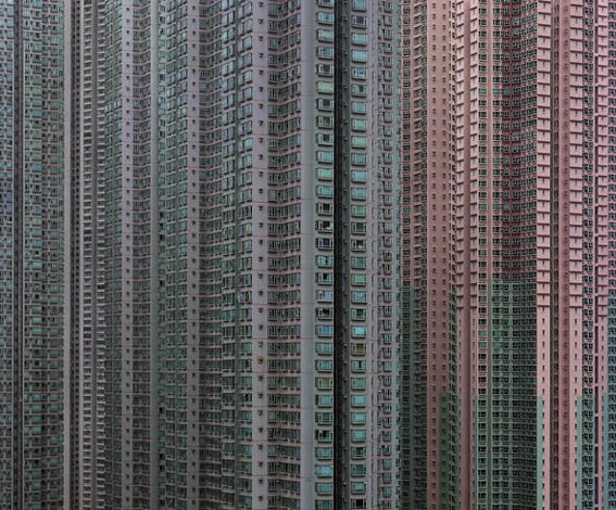
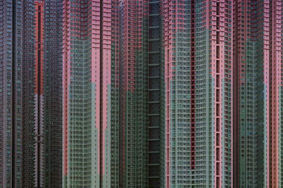
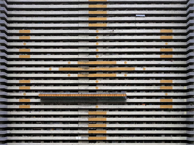
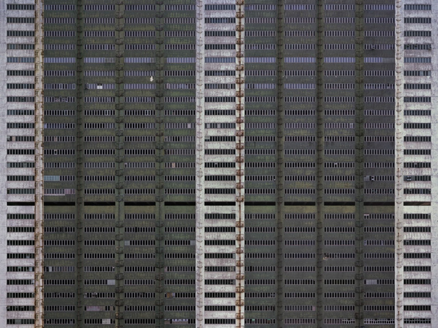
Today while having a beer after closing the studio, i was watching Paul McCartney’s “Band on the Run” video, and i started to realize how much cities have grown and changed in the last 30 to 40 years. Those early images of Singapore or Sidney that are shown in the video made me mentally juxtapose them to the photography of Michael Wolf, and here we present you his work. Wolf is a photographer born in Munich, Germany. He grew up in the USA and studied at UC Berkley and at the University of Essen in Germany.


Wolf views ordinary things in extraordinary ways. Culturally astute, Wolf’s artistic inspiration comes from the local culture in which he immerses himself. Michael Wolf has been fascinated by China’s complex urban dynamics since moving to Asia as a contract photographer in 1995 and his photography focuses on the idiosyncrasies of the Asian way of life. Insightful and absorbing, for example, his book “Hong Kong, The Front Door/The Back Door” deals with the SAR’s cultural identity through depictions of the city’s architecture.


“I love the visual chaos of China. It is a photographers dream,” says the photographer. Wolf’s poignant portrayals of the lives and living conditions of his cultural environment are subjective and personal and have earned him international acclaim. As described by Art Critic Kenneth Baker, “By their formal intelligence and acuity of observation, Wolf’s Hong Kong pictures easily earn the status of art works.”


“…Buildings that begin as monoliths are slowly humanized by their inhabitants; architecture becomes a framework upon which people can hang their personal personalities…” -Douglas Young about the work by Michael Wolf


Wolf stands by his motto: “If you are a vision and real conviction, you will find success.”


*this blog contains a text extract by Rebecca Walker

Blog Widget by LinkWithin