Showing posts with label design. Show all posts

Monday, May 17, 2010

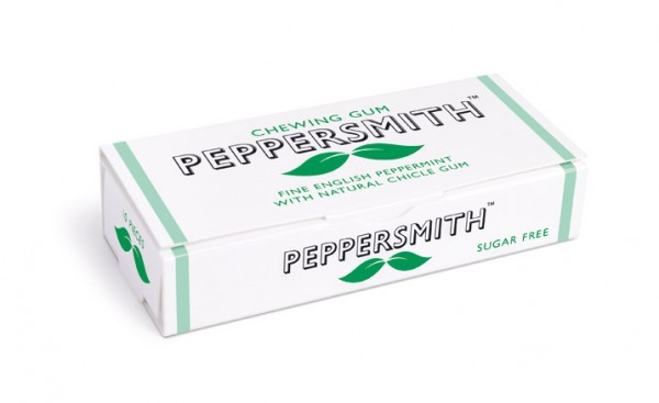
Peppersmith chewing gum with clever packaging


Two friends, Mike and Dan, started a refreshing business and presented a refreshing chewing gum Peppersmith. They've set a bunch of noteworthy values and promise that while they can't promise they'll do everything perfect they do promise they'll always do their best to do the things right. As far as we can see, they're doing great. I'm personally not a big fan of chewing gums, however, for Peppersmith I'd be willing to give them a second chance. The natural gum + intelligent design packaging wins me over every time.


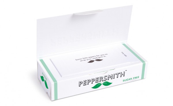
Sweetened with wood sugar from beech trees and peppermint grown in Hampshire (there are also no artificial flavours, colours, preservatives or aspartame), it's touted as the first British all-natural chewing gum that's also approved by the British Dental Health Foundation. Besides that, the packaging itself will make you buy at least one pack of Peppersmith. Each box slides out of its case to reveal a moustachioed icon like Salvador Dali and Charlie Chaplin – the moustache being a sly riff on the company's stylised mint leaf logo. Lovely attention to the details (and very useful one) is that they equipped each gum case with small slips of Post-It-like paper to wrap up used gum.


Currently available in peppermint flavor, coming soon you'll also be able to try Peppersmith in Spearmint, Cinnamon and Fish & Chips (huh?). If you've tried them, let us know how they taste.

Thursday, May 13, 2010

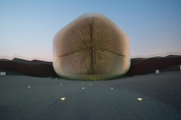
BETTER CITY, BETTER LIFE - Shanghai Expo 2010, UK Pavilion


We absolutely love the UK Pavilion at the Shanghai Expo 2010. Mastermind behind it is Heatherwick Studios, run by acclaimed architect Thomas Heatherwick.

The Pavilion's design seeks to engage meaningfully with the Expo's theme, "Better City, Better Life". It veers from the expected trend of digitally-driven pavilions and explores the relationship between nature and cities. The Pavilion is made up of two interlinked elements, the Seed Cathedral and a multilayered landscape covering 6,000 square meters.


The cathedral itself is 20 meters high and is formed from 60,000 7.5 meter-long transparent fiber optic rods, which draw light into the interior by day and at night become illuminated via inside light sources. The rods, or "optic hairs," also sway in response to the wind to bring dynamism to the structure. The overall design riffs off the mission of London's Kew Garden Millennium Seedbank, which seeks to collect the seeds of 25% of the world's plant species by 2020. It sits on a multilayered landscape continues the cathedral's texture, covering 6,000 square meters. Made of a special artificial grass, it is intended to be a welcoming and restful space for Expo visitors.


Heatherwick Studios won the British Foreign & Commonwealth Office's commission to create the Pavilion, besting other top name competitors like Zaha Hadid Architects, John McAslan + Partners, Marks Barfield Architects, Avery Associates, and DRAW Architects with dcmstudios.


Shanghai Expo runs from May 1 to October 31, 2010. See also our article on EXPO 67.

See the video. It lasts 10 mins, but it's worth it!

Wednesday, May 12, 2010

Rock Me Baby


The summer has arrived to Baja California Sur. With an average of 86 F / 30 C in May there are several ways to enjoy your day. The best one (obviously) is at the beach... And the other, our personal favorite, is at your garden, on a hammock, with a nice easy drink (mojito, michelada, a glass of wine or a fresh lemonade...) reading your favorite book and listening to some nice tunes, like The Bird and The Bee.

Today we fell in love with this knotted hanging chair by Anthropologie .


See also a hanging chair from collection Garden of Eden by Ontwerpduo.

Monday, April 26, 2010

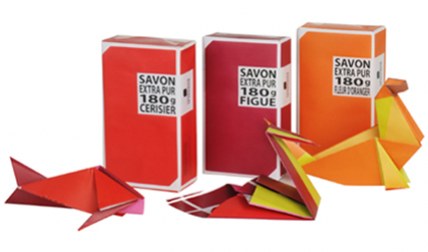
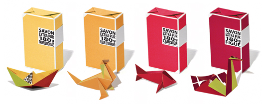
Origami soap packaging by La Compagnie de Provence

Sometimes the best surprises come in little packages. To coincide with its 20th birthday, Compagnie de Provence has added a substantial 180g version of its iconic vegetable soaps to the ranks.


Each bar, made according to Marseille tradition from local natural ingredients, comes with a tiny instruction card so that once undone, its wrapper can be transformed into an ocean-inspired piece of origami.


With eight fragrances to choose from, there's an entire menagerie waiting to be revealed, from swans to sea lions, and even a whale. Designed by Studio Plastac .

Saturday, April 24, 2010

The Future of Reading: Popular Science+ on Mag+

We love to read. We do it on-line, but we also love to hold the printed book or a magazine in our hands and flip through pages, smell the ink... As internet and new media devices develop and offer more engaged reading experience - as for example now new iPad, reading on-line becomes more and more attractive. True, you can't smell the ink (yet), but there are some projects at work which are making on-line reading (or reading on a device) more and more appealing. We have been writing already about digital magazines as seen by Mag+, and we've got an exciting letter from them - their fist Mag+ digital magazine is live: Popular Science+.


Mag+, Bonnier’s digital magazine platform, is a project that began months ago in a collaboration between Bonnier’s global R&D task force and BERG, a London-based design studio. It is now an ongoing project across all Bonnier titles in the U.S. and Europe to rethink the way magazines can be read on a new generation of full-color, touchscreen tablet devices. It’s been a fascinating journey with only 60 days available since Apple announced the iPad in San Francisco. They’ve had 6 editorial teams in 3 countries working together to re-imagine the form of magazines. The feedback from the Mag+ video was encouraging and since then they have been deconstructing tons of magazines, used more whiteboard space than any project before and building many many prototypes. They can be really proud of what they've have achieved together with the PopularScience+. And - without a doubt - there is a lot more to come.


Their design vision was to create a digital magazine, which should feel like if you are touching the actual magazine, using your natural body language – not looking through the screen and layers of buttons.

Popular Science +, the first digital magazine to emerge from Bonnier's Mag+, is a new way of experiencing magazines on digital devices and a first step toward our vision of what digital magazine reading can be. The Popular Science+ digital magazine features simple, fluid swiping motions let readers move horizontally through stories, while vertical scrolling allows them to read an article without interruption or distraction. In the app's unique Look mode, users can tap the screen to make the words disappear, highlighting the magazine's big, bold photos and illustrations. Another tap returns to Read mode.


The Bonnier Mag+ platform and the Popular Science+ magazine are based on 6 design principles:

1. Silent mode. Magazines are a luxury that readers can lose themselves in. Mag + has fewer distractions than the Web. It allows readers to lean back, away from the browser, and just focus on the bold images and rich storytelling. Reduced complexity increases a reader's immersion.
2. Fluid motion. Magazines are easy to browse, and Mag+ replicates that with a story-to-story navigation that's more like a panning camera than a flipping page. As we say, "Flow is the new flip."
3. Designed pages. Magazines are defined by their carefully conceived layouts that give readers an immediate understanding of the content and why it matters to them, a quality that got lost on magazine Web sites. Mag+ brings design back to digital publishing.
4. Defined beginning and end. Unlike the Web, magazines have a defined storyline and flow from front to back. Mag + returns to the notion that something can be, and wants to be, completed. It's the end of endlessness.
5. issue-based delivery. One of the great joys of magazines is that feeling of anticipation when a new one arrives. Mag+ maintains that by delivering full issues at once with all the same content as the print edition, and on the same schedule.
6. Advertising as content. Relevant, attractive advertising is as much a part of the magazine experience as the editorial content, and Bonnier wants Mag+ advertising to include both pin-ups and applications readers can appreciate.


Mag+ live with Popular Science+ from Bonnier on Vimeo.

Follow Bonnier and Mag+ here: www.bonnier.com/betalab, and check out Popular Science+ digital magazine on iTunes.

Thursday, April 15, 2010

Gone With the Wind

Milan is so hot right now! And we're in love with Nika Zupanc's newest collection Gone with the Wind, featured at Milan´s International Design Fair 2010 (Salone Internacionale del Mobile) as well.


Collection information by Nika:

This year’s edition of Superstudio Più will again be marked by the intriguing spirit of Nika Zupanc. With her exhibition Gone with the Wind, Nika Zupanc continues to be sincere while uncovering the excuses for a socially acceptable status quo.


By positioning archetypes that are considered feminine in the carefully selected centers of public attention, her chillingly beautiful forms become emerging reference points. Her battles are of a higher style, and so the presence of famous female literary heroines remains mandatory.


The entry point to the world of Nika Zupanc – a frame for her gallery and a prism for readings of her work – is also a metaphorical structure. It is a tiny house driven by toy-like windmills on the outside and with a big bang of connota- tions from the inside.


The Wind Pavilion stands as an icon evoking a sense for nature. With it, Nika Zupanc embraces the issue of responsibility by introducing the elegance and poetry of creative expression into predominately technical solutions.


Like so many magic pavilions in the past, this one is also outfitted in one of the latest wonders of the industry – the unique modular façade system Qbiss by trimo. Optically smooth surfaces, unique rounded corner elements, and “shadow joints” allow great freedom of expression and enable an optically enchanting combination of an inclined grid and an attractive landscape of 45 restless windmills.


Inside the Wind Pavilion Nika Zupanc put her newest family of objects on display. This time they came to address you as advocates of a sort because they present a case for new symbolic and emotional readings of design, and are told through elements of modesty and self-reliance.


Instant fave!

You can see more on Salone 2010 on Dezeen.

Sunday, February 28, 2010


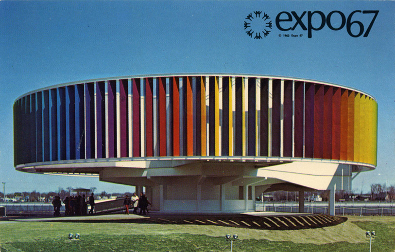
There have been two approaches to designing world's fair architecture. One was to dictate the overall architectural style of the buildings like that of the 1893 World Columbian Exposition. The other was to allow pavilion architects free reign in their creative design. Expo 67 officials decided to allow free reign in architectural style as long as participant's pavilions fit in with the overall loose theme "Man and his World."

By the time Expo 67 was conceived, city architecture had become quite conservative and filled our cities with economical, predictable tall boxy buildings. It was exactly the unexciting style that the business society welcomed, but the effect was boring and it deprived cities a sense of identity. This same design philosophy proved expensive in large apartment buildings and public housing projects. Worse they robbed the individual or family, who lived there, a sense of identity they had when they lived in individual homes with gardens, porches and yards.

Architects of social consciousness were thinking of solutions to cover more space with less material and for less money in ways that didn't rob the individual of his identity. At the same time these architects wanted to make a creative statement. So when participating countries held architectural competitions for their country's pavilions, some unusual architecture evolved.

Perhaps the most innovative concept to be used at Expo was "space- frame" architecture. In an effort to "Do more with Less" architects covered large spaces cheaply and flexibly, by distributing the building's weight over a wide area, and by using complex techniques involving aluminum, plastic and other materials. The pavilions that used that technique were the United States pavilion, the Netherlands pavilion, the West German pavilion and the two big theme complexes, Man the Producer and Man the Explorer.

NETHERLANDS PAVILION

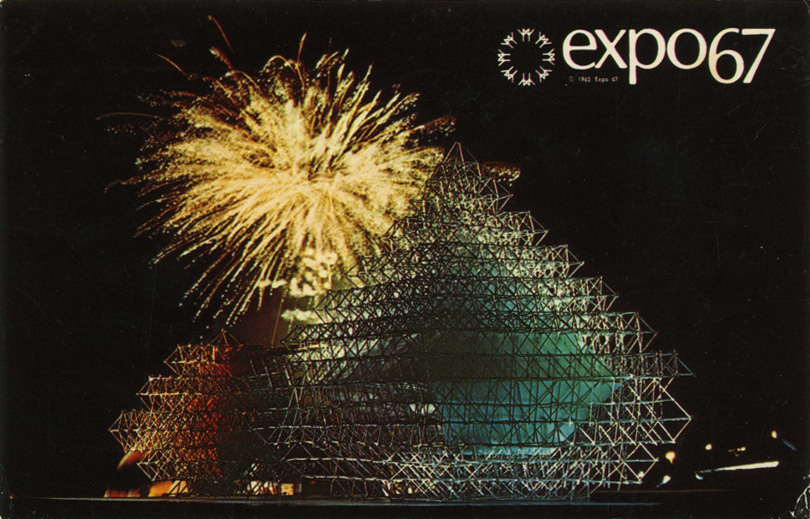
The Netherlands pavilion was an engineering triumph, a space frame structure consisting of 33 miles (57,000 pieces , each three feet long) of aluminum tubing. They didn't weld or rivet the pieces together, rather it was put together like a Gilbert Erector set, with wrenches. The exhibition room was suspended inside. The technique had its advantages in that if the building needed to expand, the builders could just add more pieces. It was a very flexible approach to building design and gave the structure a feeling of lightness.
The Dutch designed a "space-frame" building out of 57,000 pieces of aluminum tubing.


GERMANY PAVILION

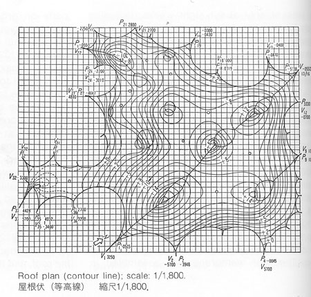
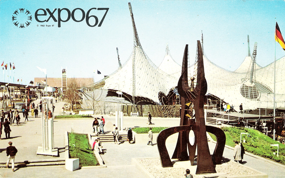
Frei Otto's elegant space frame tent was used to cover the German pavilion's exhibit area. While it took the architect several years to develop his system, it only took six weeks to build. His system used a roof of steel mesh suspended from eight slender steel masts of varied height, situated at irregularly intervals and supported by steel cables anchored outside the structure, covered an area the size of a city block. The roof's steel mesh net, hung from the guy wires, was then covered by a translucent plastic skin. The tent itself and all of its components were fabricated in Germany.
The German Pavilion was covered with a modernistic tent.

The structure adequately dealt with the twin problems of aesthetics and economics. At the least it was a fanciful way of escaping from the tyranny of the box, but it also produced a unique and beautiful interior space. The space below was lit through the transparent plastic and through odd-shaped windows in the roof. As to cost, the building wasn't cheap to build since it was a one of a kind project. But it had potential for its steel and plastic roof weighed only 150 tons; one third to one fifth the weight of normal roofing materials. The tent concept had the ability to adapt to irregular topography of any site. The concept was used again with a much larger tent to enclose the swimming stadium at Munich's 1972 Summer Olympics.

UNITED STATES PAVILION
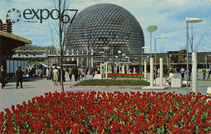
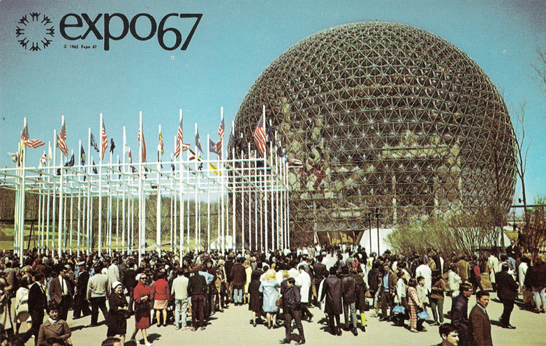
The United States pavilion's designers choose a Buckminster Fuller dome, two hundred feet high (20 stories) and 250 feet in diameter. As in all of Fuller's domes both little and big, they used three- dimensional units, a triangle on the outside, hexagonal on the inside, and curved to fit a given arc, as its structural basis. By connecting them together in the shape of a dome, it distributed the structure's weight over the whole surface. To avoid his usual half-dome that produced a squat look, the pavilion's designers built a beautifully proportioned, three-quarter sphere that fit the site ideally.
The United States Pavilion was a Buckminster Fuller dome.

It was the most complicated of his domes. It used an elaborate system of retractable shading screens to control the heat within. A computer adjusted the screens in accordance with the sun's rays. Its exterior covering was exquisitely tinted, and surprisingly it was lovely to look at.


MAN THE EXPLORER & MAN THE PRODUCER

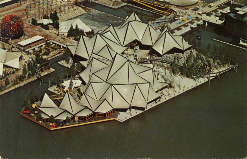
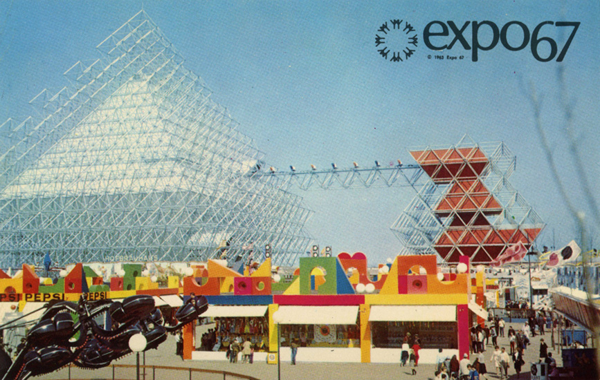
The architects (the firm of Affleck, Desbarets, Dimakopoulos, Lebensold and Sise) of the theme complexes were faced with the need to produce, quickly, some large buildings with large areas of open spaces. They decided to make them out of a type of small building blocks, much in the way the Dutch constructed their pavilion out of short metal tubes. The Canadian architects choose the truncated tetrahedron shape,- a four-sided triangular figure with the corners cut off, then flattened so that it looked like a prism. Thousands of these blocks would "nest" with other blocks, large and small, and be built up quickly into theme pavilions.
Several of the Theme pavilions used "space-frame" architecture to create large inexpensive display spaces.

The designs and models looked graceful, but the steel fabricators complained that there weren't enough welders in Canada to make the truncated tetrahedrons the architects would need. As a result, the units were bolted together and the pieces heavily braced. The final result was at all graceful, but was heavy and oppressive - miles and miles of thick rusted metal.


OTHER NOTEWORTHY PAVILION ARCHITECTURE

Both the Japanese and Man the Community pavilions used static forms composed of alternating crossing beams. The difference in their shapes was in the positioning of those basic structural elements. In the Japanese Pavilion, vertical stacking created a series of interconnecting cubes, but it closely resembled a concrete but graceful log cabin. On the other hand, the profile of Man in the Community resembled a Chaldean ziggurat. The wooden beams were placed so that the formed wooden polygons that rose in decreasing size from foot to summit.
Man the Community Pavilion

The Soviet Unions' Pavilion, by using great walls of glass and aluminum topped by a ski-jump roof, was a departure from its traditional monolithic architectural style. The escalator that lead up into the pavilion prepared the visitor for the surprise of the wide-angled V beams that supported its upswept roof, and carried him into a symmetrically organized display area dominated by a huge bust of Lenin. Inside was a show of technology and the progress of the country's space program.

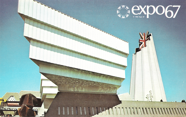
Britain's was a ponderous castle-like pavilion, whose walls, while made of a kind of cardboard, looked like stone. The jagged top of its 200 foot tall cone-like tower topped by a Pop Art version of the Union Jack, represented incomplete construction. It symbolized Britain's unfinished contribution to the world. Fortunately the exhibits inside were very uplifting as the British made an attempt to charm the visitor.


The French Pavilion, on the other hand, modeled itself on the fine art of sculpture. While it was tastefully executed, architectural critics perceived its fins as merely tacked on. In the great well of the building, the floors full of exhibits were arranged around an open space. Its arrangement of interior stairways and balconies, which gave it an airy feel, was often overshadowed their attempt to overwhelm the visitor with technical displays

Austria's pavilion used the space-frame concept to a certain degree. It used triangular building units to construct large habitable cells. The result was a striking exterior architectural form, geometrical in style, that worked well as interior exhibit space.

HABITAT 67

Habitat 67, an experiment in apartment living, became the permanent symbol of Expo 67 after it closed. It was Canadian architect Moshe Safdie's experiment to make a fundamentally better and cheaper housing for the masses. He attempted to make a revolution in the way homes were built - by the industrialization of the building process; essentially factory mass production. He felt that it was more efficient to make buildings in factories and deliver them prefabricated to the site.

Safdie was dissatisfied with both suburbia, which destroyed open space surrounding cities and cut off people's enjoyment of the amenities of city life, and with the high-rise apartment block, which concentrated people on less land. Apartments generally were too small for growing families, and lacked both privacy and outdoor space. He was convinced the later were inadequate as family housing.

He planned Habitat with the goal to find a way to put a great many people on a small space, yet provide them with at least some of the pleasures of a private home. He wanted to build a city in the sky, a 3- D city and his city would contain 1000 housing units, with shops and even a school. What he proposed was an experiment, not just in housing, but in community life.

But between 1964 and 1966 when construction started, it was downsized to only 158 dwelling units, without shops and a school. What started out as a plan for a small city, instead became a hugely expensive apartment building. Worse, while it was on Expo 67 grounds, when Expo 67 closed, it would be some distance from the rest of Montreal's business and housing neighborhoods.
Habitat's 158 living units resembled a Taos Indian pueblo.

As Habitat was designed, it resembled a curious concrete mountain of dwelling places, strikingly modern, yet reminiscent of a Taos Indian pueblo village, or an Italian hill town. Its units were built on the ground, then hoisted by crane into place five, six or more stories above the ground.

A factory was built beside the Habitat site. It contained four large molds in which the standardized units were made. To make each of them, a reinforcing steel cage was placed inside the mold, then concrete was poured around the cage. After the concrete cured, the unit was moved to an assembly line where a wooden sub-floor was installed with electrical and mechanical services below it. Windows and insulation were then inserted; afterwards prefabricated bathrooms and kitchen modules. Finally the unit was moved to its position in the building.

There were 354 of these units in all. But it was the way they were put together than produced the variety of forms that made Habitat, both inside and outside, so unusual. The units were arranged to provide fifteen different types of "houses". These varied from one-bedroom houses (600 sq. feet) to four-bedroom houses (1,700 sq. feet). Each had a private open garden space, 37 x 17 feet. Each man's roof was another man's garden. The arrangement of the units provided privacy and the variation in house layouts provides a sense of uniqueness.

While factory production techniques should have cut overall costs, building 158 apartments isn't really productive in factory work since there is often a steep learning curve. Also since the individual units would bear the weight load of the units above, the units on the bottom where actually thicker and stronger. In the end Habitat 67 cost $22,195,920, or about $140,000 per living unit. Effectively that was the same cost as building six-eight ordinary town houses. Luckily one could rationalize that it was only a prototype, and if scaled up, it might be much cheaper to construct.

While the visiting public was impressed, they didn't embrace the concept. At a distance the complex looked like an exciting piece of Cubist sculpture, at close up it's flat concrete-gray exterior looked boring and as if nobody lived there. Inside the complex Safdie's plastic covered pedestrian streets, connecting the apartments with the elevators and parking lots, were poorly sheltered from Montreal's cold window weather. Perhaps if it had been built near one of Montreal's exciting neighborhoods, the public might have been more willing to accept it, but then few of Expo's fifty million visitors would have seen the innovative housing site.

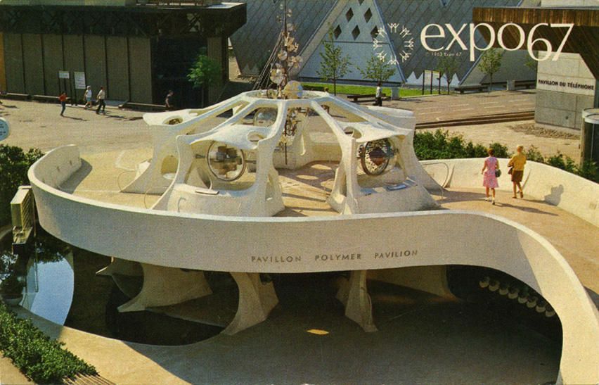
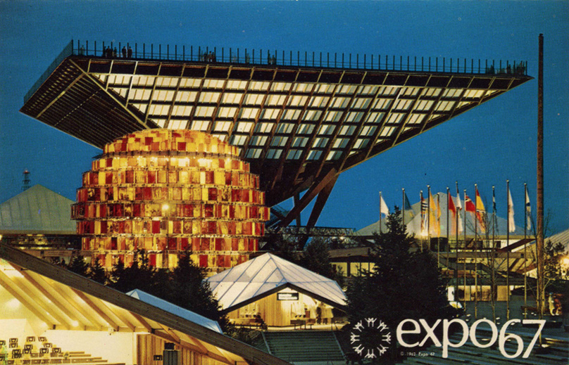
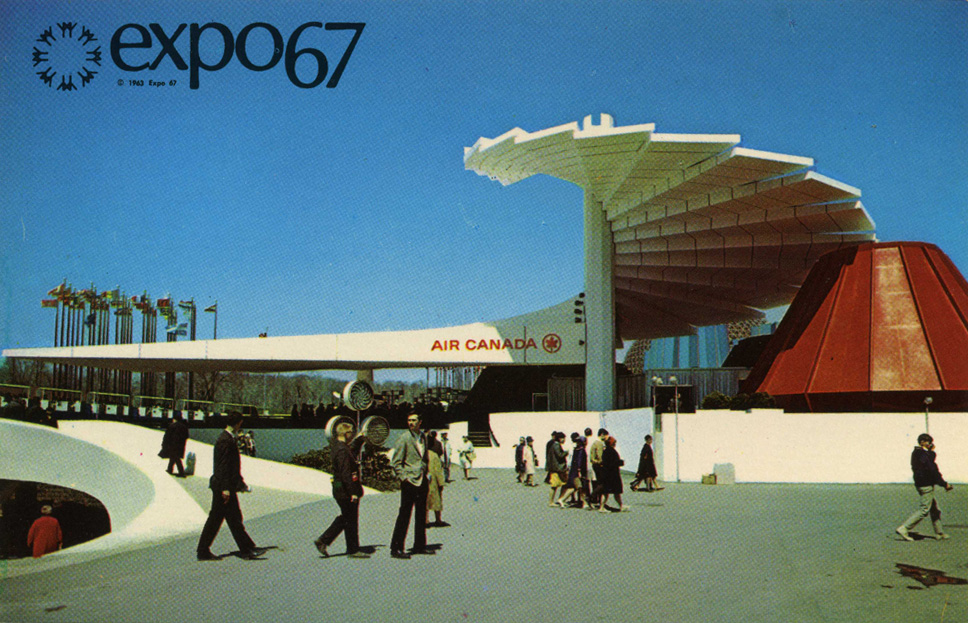
More images of the Expo:
The polymer Pavilion

La Ronde

Canada Pavilion

Air Canada Pavilion
Thursday, February 11, 2010

BLOOMFRAME


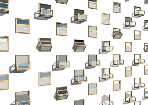
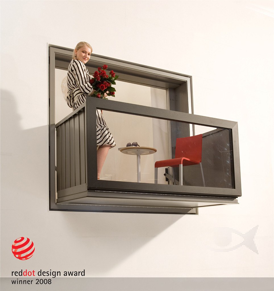
The revolutionary balcony Bloomframe is designed and patented by Hofman Dujardin Architects based in Amsterdam The Netherlands. The Research & Development department from Hurks geveltechniek based in Veldhoven The Netherlands turned the design concept into a spectacular functional prototype.

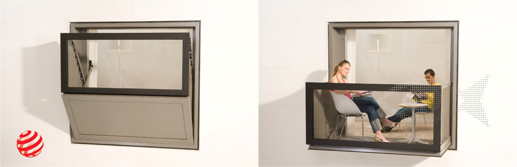
The dynamic balcony offers a solution for compact apartments in dense urban areas. By transforming the elevation into a horizontal surface an outdoor terrace is added to an apartment. Bloomframe can play a significant role in the real estate property of the future.
 
The Bloomframe window can be used in various surroundings. Apartments for students can be easily equipped with an outdoor space. Hotels can add luxurious terraces to their rooms. In large scale renovations of former warehouses balcony's can be created by adding Bloomframe windows to the building. Complex constructions of balcony's or loggias are not longer the only option.
With one push on a button the balcony opens smoothly within 15 seconds. On the few square meters which are generated two persons can enjoy breakfast in the open air. Although the construction is extremely solid, the balcony looks elegant and transparent. During the development of the prototype safety had the highest priority. The upcoming months the development process continues. The final product is expected to be presented at the end of this year. Bloomframe is a registered trademark.


CHECK THE VIDEO!!

Monday, February 8, 2010

The Future of German Graphic Design


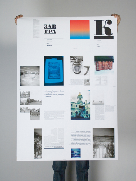
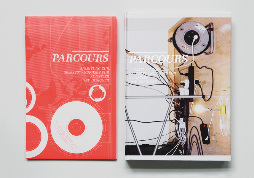
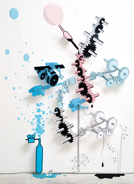
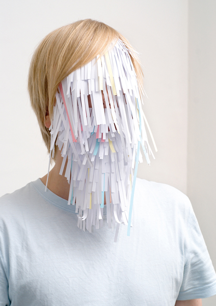
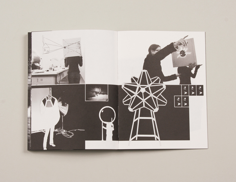
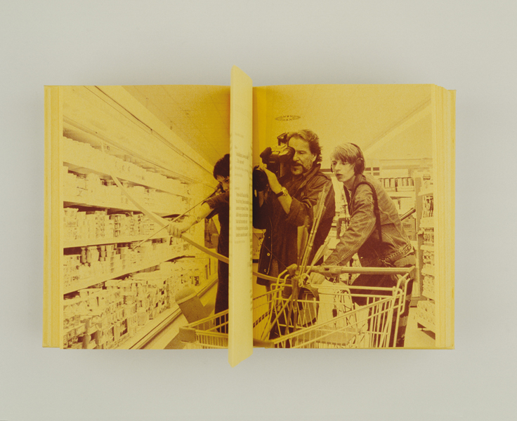
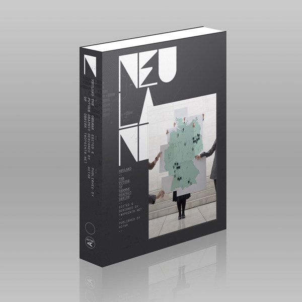
Neuland - The Future of German Graphic Design reveals a previously undiscovered territory - in search of young talent that will shape the future of German graphic design. Neuland asks questions in place of providing answers: Are preconceived notions about German graphic design correct; does German graphic design really even exist? The answer to these inquires involved a journey to Germany, getting to know its German and immigrant designers, and a trip beyond Germany‘s borders, in pursuit of German designers who live abroad.

THIBAUD TISSOT Describe your working process: "I have no general recipe, but I know I'm obsessed.", What is German? "A strange mix of warmth and coldness, sometimes surprising."

Neuland provides a helpful map of information for designers curious about study, lectures, workshops, books, or exhibitions in Germany; those individuals that want to learn about the history of design in Germany.

KATRIN SCHACKE What is German? "Fences.", What is German design? "Vernacular, sensible, sometimes a bit chilly." What do you aim to achieve with your work? "I try to tempt people with pictures. Familiar things are taken out of their context and presented from an unaccustomed angle."

The editors of Neuland, struggled with all the usual big, philosophical questions while putting their book together: What is German design? What is German? Who cares? If they were Ellen Lupton or Steven Heller, they might have spent pages upon pages ruminating on these issues. Instead, they did what any editors who are actually designers by trade might do — they asked their 51 subjects for all the answers. In mini-interviews accompanying each entry, some said German design was “a cuckoo clock,” while others described it as “strips of pork” or “a bit chilly.” Each subject was also asked to submit a picture of their studio surroundings, of their workspace, and of “something utterly German.”

PIXELGARTEN What is German? "Punctual, orderly, reliable. And Germany has the best sausage, so we've been told by some Japanese people."

PIXELGARTEN What is German design? "Not, in fact, typically German. And perhaps it's also often undervalued."


Although the book has a lot of moving parts, it’s more than just the sum of them. As you reach the end, you may not have a firm grasp on what, if anything, makes nationality so important in one of the world’s most globalized professions, but you do get to know Germany’s next generation of talent in small but poignant ways, right down to their enduring obsession with currywurst.

HEIMANN UND SCHWANTES What is German? "Beige. Round. Indeterminate."
HEIMANN UND SCHWANTES What is German design? "Grass green to turquoise. Oval. Fully functional."

FL@33 What is German design? "While I was studying in Germany in the mid-'90s I would have associated the graphics with the Bauhaus and the ULM school. Product design definitely with Braun and Siemens. Nowadays, I'm not so sure."


From Neuland: The Future of German Graphic Design, by Twopoints.net. Copyright 2009 by the authors and reprinted with permission from ACTAR.

[seen @ SightUnseen]

Blog Widget by LinkWithin