Showing posts with label product design. Show all posts

Monday, May 17, 2010

Peppersmith chewing gum with clever packaging


Two friends, Mike and Dan, started a refreshing business and presented a refreshing chewing gum Peppersmith. They've set a bunch of noteworthy values and promise that while they can't promise they'll do everything perfect they do promise they'll always do their best to do the things right. As far as we can see, they're doing great. I'm personally not a big fan of chewing gums, however, for Peppersmith I'd be willing to give them a second chance. The natural gum + intelligent design packaging wins me over every time.
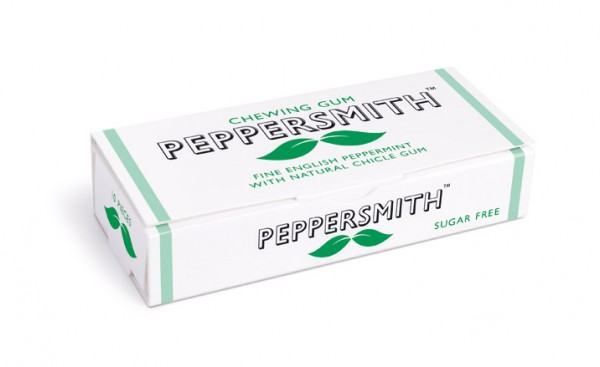


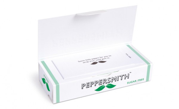
Sweetened with wood sugar from beech trees and peppermint grown in Hampshire (there are also no artificial flavours, colours, preservatives or aspartame), it's touted as the first British all-natural chewing gum that's also approved by the British Dental Health Foundation. Besides that, the packaging itself will make you buy at least one pack of Peppersmith. Each box slides out of its case to reveal a moustachioed icon like Salvador Dali and Charlie Chaplin – the moustache being a sly riff on the company's stylised mint leaf logo. Lovely attention to the details (and very useful one) is that they equipped each gum case with small slips of Post-It-like paper to wrap up used gum.


Currently available in peppermint flavor, coming soon you'll also be able to try Peppersmith in Spearmint, Cinnamon and Fish & Chips (huh?). If you've tried them, let us know how they taste.

Wednesday, May 12, 2010

Rock Me Baby


The summer has arrived to Baja California Sur. With an average of 86 F / 30 C in May there are several ways to enjoy your day. The best one (obviously) is at the beach... And the other, our personal favorite, is at your garden, on a hammock, with a nice easy drink (mojito, michelada, a glass of wine or a fresh lemonade...) reading your favorite book and listening to some nice tunes, like The Bird and The Bee.

Today we fell in love with this knotted hanging chair by Anthropologie .


See also a hanging chair from collection Garden of Eden by Ontwerpduo.

Monday, April 26, 2010

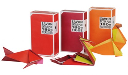
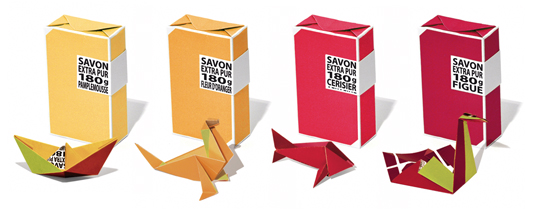
Origami soap packaging by La Compagnie de Provence

Sometimes the best surprises come in little packages. To coincide with its 20th birthday, Compagnie de Provence has added a substantial 180g version of its iconic vegetable soaps to the ranks.


Each bar, made according to Marseille tradition from local natural ingredients, comes with a tiny instruction card so that once undone, its wrapper can be transformed into an ocean-inspired piece of origami.


With eight fragrances to choose from, there's an entire menagerie waiting to be revealed, from swans to sea lions, and even a whale. Designed by Studio Plastac .

Thursday, April 15, 2010

Gone With the Wind

Milan is so hot right now! And we're in love with Nika Zupanc's newest collection Gone with the Wind, featured at Milan´s International Design Fair 2010 (Salone Internacionale del Mobile) as well.


Collection information by Nika:

This year’s edition of Superstudio Più will again be marked by the intriguing spirit of Nika Zupanc. With her exhibition Gone with the Wind, Nika Zupanc continues to be sincere while uncovering the excuses for a socially acceptable status quo.


By positioning archetypes that are considered feminine in the carefully selected centers of public attention, her chillingly beautiful forms become emerging reference points. Her battles are of a higher style, and so the presence of famous female literary heroines remains mandatory.


The entry point to the world of Nika Zupanc – a frame for her gallery and a prism for readings of her work – is also a metaphorical structure. It is a tiny house driven by toy-like windmills on the outside and with a big bang of connota- tions from the inside.


The Wind Pavilion stands as an icon evoking a sense for nature. With it, Nika Zupanc embraces the issue of responsibility by introducing the elegance and poetry of creative expression into predominately technical solutions.


Like so many magic pavilions in the past, this one is also outfitted in one of the latest wonders of the industry – the unique modular façade system Qbiss by trimo. Optically smooth surfaces, unique rounded corner elements, and “shadow joints” allow great freedom of expression and enable an optically enchanting combination of an inclined grid and an attractive landscape of 45 restless windmills.


Inside the Wind Pavilion Nika Zupanc put her newest family of objects on display. This time they came to address you as advocates of a sort because they present a case for new symbolic and emotional readings of design, and are told through elements of modesty and self-reliance.


Instant fave!

You can see more on Salone 2010 on Dezeen.

Wednesday, February 3, 2010


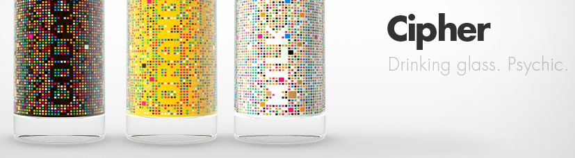
Serbian product designer Damjan Stankovic [relogik] present us CIPHER:

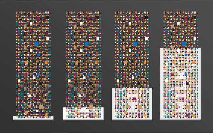
An empty glass resembles a meaningless colorful mosaic, until a liquid is poured into it, revealing its name. Each side of the glass is reserved for a specific drink. The Dekrypt glass though complex in appearance in fact runs on a very simple idea. Differently colored shapes are scattered across the glass surface in a seemingly random pattern, however their position is hardly accidental. The true purpose of the glass mosaic is revealed when colored liquid is poured into it (orange juice, milk, Nescafe or coke) The pattern of shapes and empty spaces on the glass combined with the color of the liquid inside the glass end up forming a textual sign, revealing what exact drink or refreshment you are having, with each side of the glass reserved for a specific drink. Besides being a novelty item with entertainment value it can also serve as a marketing item for beverage companies as it has a promotional potential.


Tuesday, February 2, 2010

McFancy


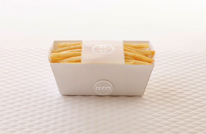
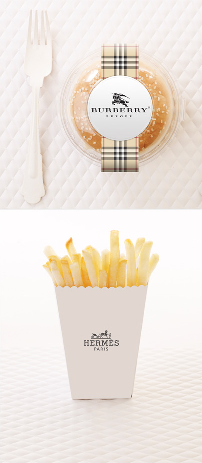
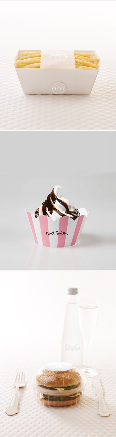
Created by the Access Agency (packaging designed by Amy Moss of Eat. Drink. Chic. and photographed by Marija Ivkovic). McFancy is set to launch at fashion weeks around the world :

"Today’s demanding consumers expect even their beloved, favorite brands to step up their game. Many run-away online successes of offline brand “stunts” attest that consumers expect, and get really excited about, experiences that are unusual, fun, thought-provoking and emotionally engaging. With the power and immediacy of social media, surprising offline events and stunts have now turned into truly powerful promotional tools.


In 2010, TCH will launch Access Agency. It is a dedicated entity that will continue our work of creating highly original, transformational, yet eminently practical and results-oriented strategies for companies to stage the kinds of offline brand experiences that will increase the economic value of their offering.

For McDonald’s, we envision a cool, surprising and fun mix of concepts. First is McFancy, an upmarket temporary McDonald’s store that launches at Fashion Weeks around the globe — London, New York, Paris, Milan, Sydney, Hong Kong. McFancy is part art installation, gathering spot and, of course, a restaurant that offers a traditional McDonald’s menu but packaged in a way that makes a playful yet stylish nod to the lifestyle of the highly desirable, influential consumers that attend Fashion Weeks."

Thursday, July 2, 2009

DingDong

If you are bored of your old doorbell, here a couple of fun options from the chinese designer Li Jianye who is a product design consultant at Philips Design Hong Kong...


Blog Widget by LinkWithin