
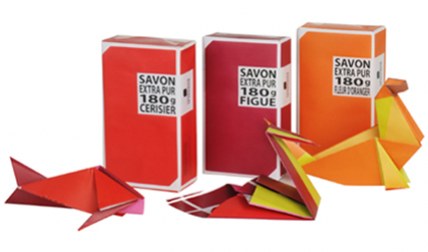
Sometimes the best surprises come in little packages. To coincide with its 20th birthday, Compagnie de Provence has added a substantial 180g version of its iconic vegetable soaps to the ranks.
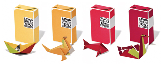
Each bar, made according to Marseille tradition from local natural ingredients, comes with a tiny instruction card so that once undone, its wrapper can be transformed into an ocean-inspired piece of origami.
With eight fragrances to choose from, there's an entire menagerie waiting to be revealed, from swans to sea lions, and even a whale. Designed by Studio Plastac .
Showing posts with label Graphic Design. Show all posts
Showing posts with label Graphic Design. Show all posts
Monday, April 26, 2010
Origami soap packaging by La Compagnie de Provence



Saturday, April 24, 2010
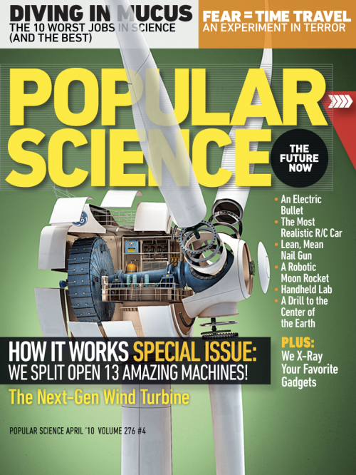
The Future of Reading: Popular Science+ on Mag+
We love to read. We do it on-line, but we also love to hold the printed book or a magazine in our hands and flip through pages, smell the ink... As internet and new media devices develop and offer more engaged reading experience - as for example now new iPad, reading on-line becomes more and more attractive. True, you can't smell the ink (yet), but there are some projects at work which are making on-line reading (or reading on a device) more and more appealing. We have been writing already about digital magazines as seen by Mag+, and we've got an exciting letter from them - their fist Mag+ digital magazine is live: Popular Science+.
Mag+, Bonnier’s digital magazine platform, is a project that began months ago in a collaboration between Bonnier’s global R&D task force and BERG, a London-based design studio. It is now an ongoing project across all Bonnier titles in the U.S. and Europe to rethink the way magazines can be read on a new generation of full-color, touchscreen tablet devices. It’s been a fascinating journey with only 60 days available since Apple announced the iPad in San Francisco. They’ve had 6 editorial teams in 3 countries working together to re-imagine the form of magazines. The feedback from the Mag+ video was encouraging and since then they have been deconstructing tons of magazines, used more whiteboard space than any project before and building many many prototypes. They can be really proud of what they've have achieved together with the PopularScience+. And - without a doubt - there is a lot more to come.
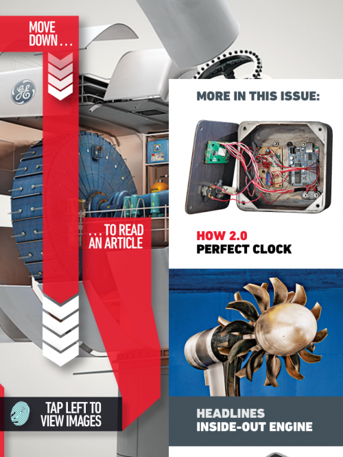
Their design vision was to create a digital magazine, which should feel like if you are touching the actual magazine, using your natural body language – not looking through the screen and layers of buttons.
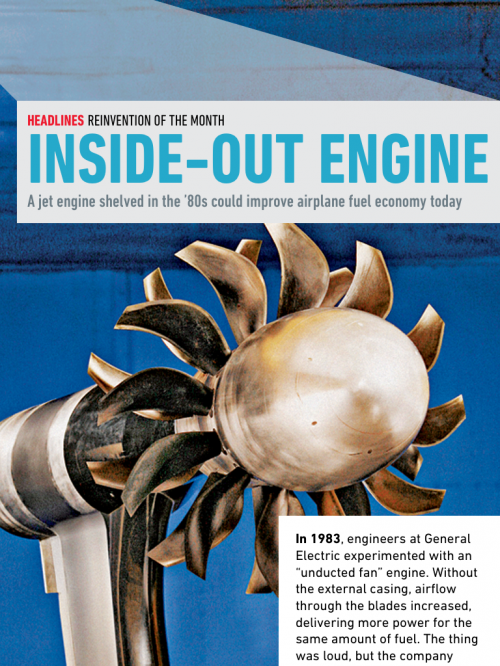
Popular Science +, the first digital magazine to emerge from Bonnier's Mag+, is a new way of experiencing magazines on digital devices and a first step toward our vision of what digital magazine reading can be. The Popular Science+ digital magazine features simple, fluid swiping motions let readers move horizontally through stories, while vertical scrolling allows them to read an article without interruption or distraction. In the app's unique Look mode, users can tap the screen to make the words disappear, highlighting the magazine's big, bold photos and illustrations. Another tap returns to Read mode.
The Bonnier Mag+ platform and the Popular Science+ magazine are based on 6 design principles:
1. Silent mode. Magazines are a luxury that readers can lose themselves in. Mag + has fewer distractions than the Web. It allows readers to lean back, away from the browser, and just focus on the bold images and rich storytelling. Reduced complexity increases a reader's immersion.
2. Fluid motion. Magazines are easy to browse, and Mag+ replicates that with a story-to-story navigation that's more like a panning camera than a flipping page. As we say, "Flow is the new flip."
3. Designed pages. Magazines are defined by their carefully conceived layouts that give readers an immediate understanding of the content and why it matters to them, a quality that got lost on magazine Web sites. Mag+ brings design back to digital publishing.
4. Defined beginning and end. Unlike the Web, magazines have a defined storyline and flow from front to back. Mag + returns to the notion that something can be, and wants to be, completed. It's the end of endlessness.
5. issue-based delivery. One of the great joys of magazines is that feeling of anticipation when a new one arrives. Mag+ maintains that by delivering full issues at once with all the same content as the print edition, and on the same schedule.
6. Advertising as content. Relevant, attractive advertising is as much a part of the magazine experience as the editorial content, and Bonnier wants Mag+ advertising to include both pin-ups and applications readers can appreciate.
Mag+ live with Popular Science+ from Bonnier on Vimeo.
Follow Bonnier and Mag+ here: www.bonnier.com/betalab, and check out Popular Science+ digital magazine on iTunes.
Monday, February 8, 2010
The Future of German Graphic Design

Neuland - The Future of German Graphic Design reveals a previously undiscovered territory - in search of young talent that will shape the future of German graphic design. Neuland asks questions in place of providing answers: Are preconceived notions about German graphic design correct; does German graphic design really even exist? The answer to these inquires involved a journey to Germany, getting to know its German and immigrant designers, and a trip beyond Germany‘s borders, in pursuit of German designers who live abroad.
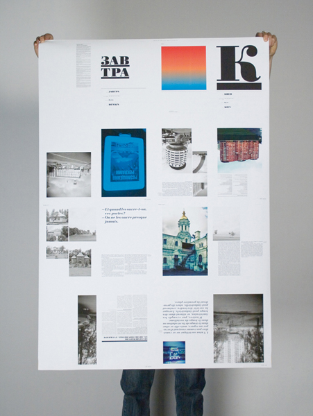
Neuland provides a helpful map of information for designers curious about study, lectures, workshops, books, or exhibitions in Germany; those individuals that want to learn about the history of design in Germany.
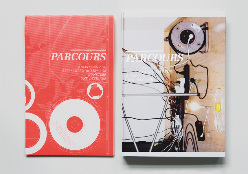
The editors of Neuland, struggled with all the usual big, philosophical questions while putting their book together: What is German design? What is German? Who cares? If they were Ellen Lupton or Steven Heller, they might have spent pages upon pages ruminating on these issues. Instead, they did what any editors who are actually designers by trade might do — they asked their 51 subjects for all the answers. In mini-interviews accompanying each entry, some said German design was “a cuckoo clock,” while others described it as “strips of pork” or “a bit chilly.” Each subject was also asked to submit a picture of their studio surroundings, of their workspace, and of “something utterly German.”
Although the book has a lot of moving parts, it’s more than just the sum of them. As you reach the end, you may not have a firm grasp on what, if anything, makes nationality so important in one of the world’s most globalized professions, but you do get to know Germany’s next generation of talent in small but poignant ways, right down to their enduring obsession with currywurst.
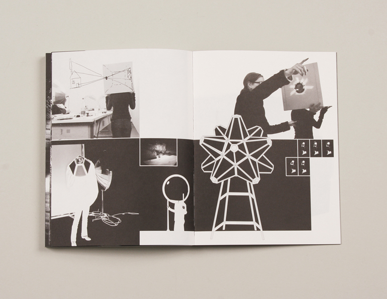
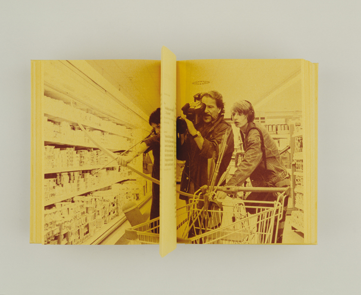
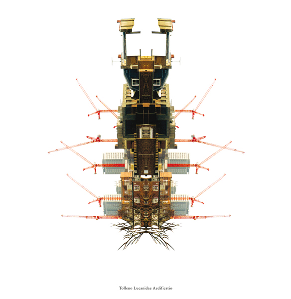
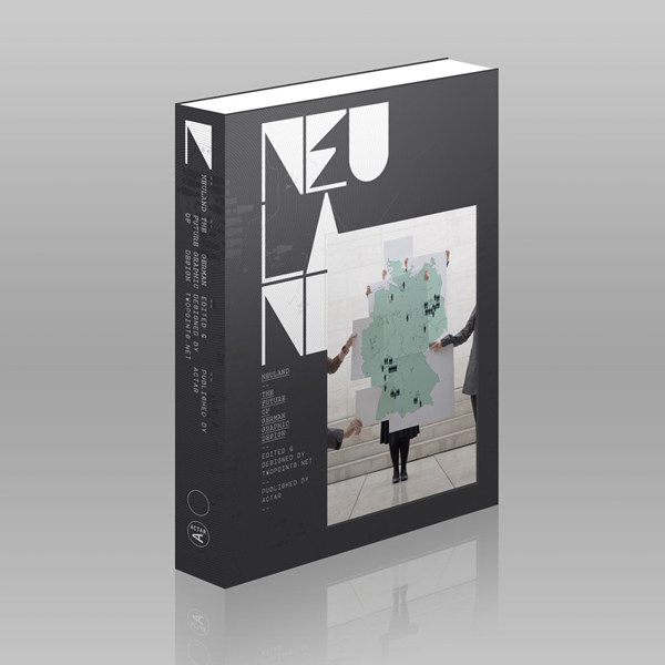
From Neuland: The Future of German Graphic Design, by Twopoints.net. Copyright 2009 by the authors and reprinted with permission from ACTAR.
[seen @ SightUnseen]
Tuesday, February 2, 2010
McFancy
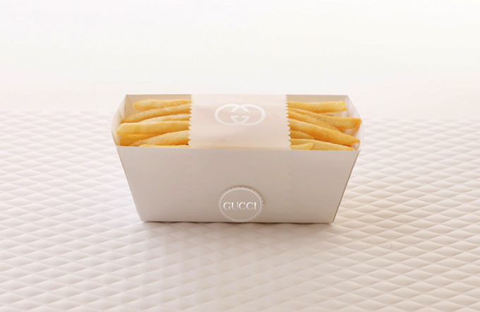
"Today’s demanding consumers expect even their beloved, favorite brands to step up their game. Many run-away online successes of offline brand “stunts” attest that consumers expect, and get really excited about, experiences that are unusual, fun, thought-provoking and emotionally engaging. With the power and immediacy of social media, surprising offline events and stunts have now turned into truly powerful promotional tools.
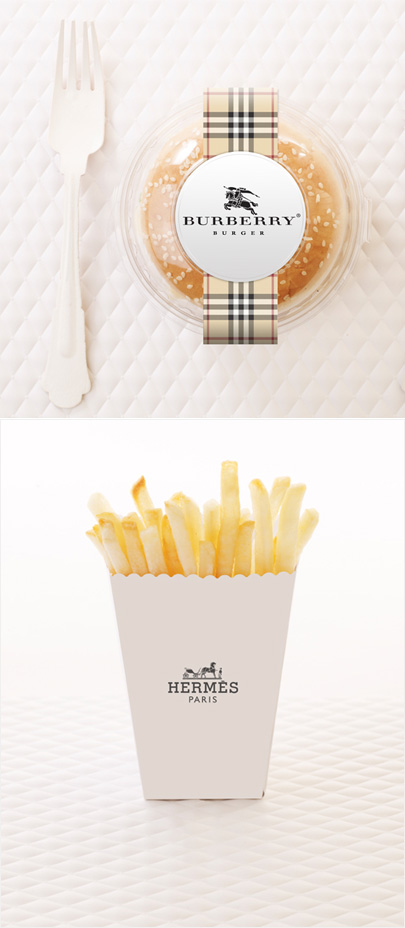
In 2010, TCH will launch Access Agency. It is a dedicated entity that will continue our work of creating highly original, transformational, yet eminently practical and results-oriented strategies for companies to stage the kinds of offline brand experiences that will increase the economic value of their offering.
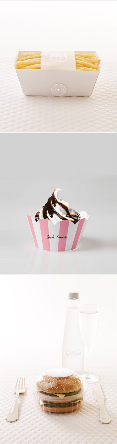
For McDonald’s, we envision a cool, surprising and fun mix of concepts. First is McFancy, an upmarket temporary McDonald’s store that launches at Fashion Weeks around the globe — London, New York, Paris, Milan, Sydney, Hong Kong. McFancy is part art installation, gathering spot and, of course, a restaurant that offers a traditional McDonald’s menu but packaged in a way that makes a playful yet stylish nod to the lifestyle of the highly desirable, influential consumers that attend Fashion Weeks."
Sunday, January 31, 2010
weekend visual fix
we checked this past weekend some nice packaging:
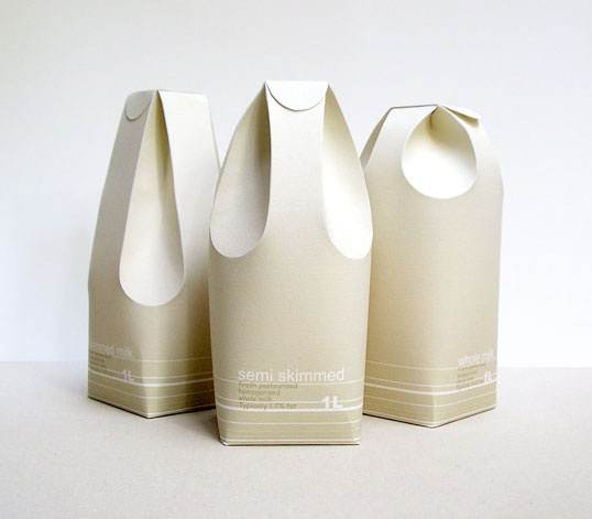
Designed by Raw Edges | Country: United Kingdom
An excellent example of structural package design applied in a functional and communicative way.
“These three different milk cartons distinguish between the rates of fat in the milk by using form rather than colour. The form of the milk cartons reflects in a way on the milk’s texture and smoothness. The two back folds are used as the carton’s handle, while the two in the front function as the spout.”
---
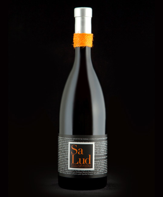
Designed by Spavilla Designs | Country: Spain
“Health is the promotional wine from Spavilla Designs. An elaborate packaging for this limited edition, which the prestigious Robert Parker has given a rating of 93 points.”
---
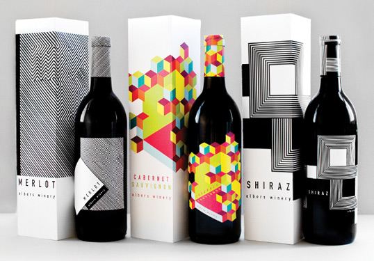
Designed by Meeta Panesar | Country: United States
“The design is inspired by the colors and designs of Joseph Albers and the Op Art movement. The usage of the rectangular elements reflects Alber’s “Homage to the Square,” a series of paintings begun in 1949.”
---
Designed by Marcel Buerkle | Country: South Africa
This elegant, copy driven packaging concept is the work of South African based designer Marcel Buerkle. The shape and cleanliness of the design almost gives it a bit of a high end perfume look and feel.
---
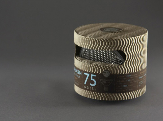
Designed by Mongkol Praneenit | Country: United States
“This is a redesigned for General Electric high-end light bulbs. The package is designed with recycled material to promote sustainability. Information is cleanly organized into a label system to reduce printing over the whole package.”
---
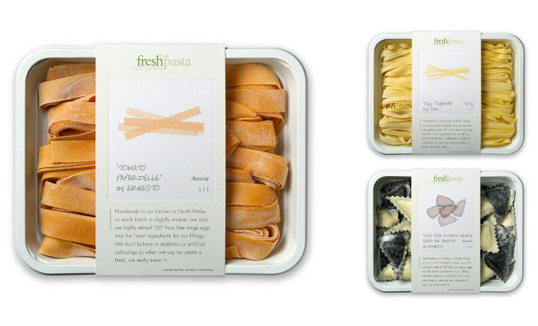
Designed by P&W | Country: United Kingdom
“The brief: Packaging for a company producing high end, handmade fresh pasta. The solution: We created fine art style prints of the pasta shapes, each one signed by ‘the artist’. The result: Improved sales and increased listings with no advertising support.”
---
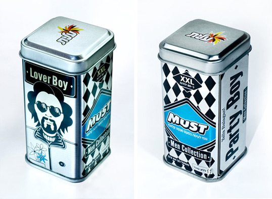
Designed by Oi Design Studio | Country: Israel
“The Brief: When The Strauss group fixed the intention of launching a series of consumer products aimed at men, they requested that we devise a marketing concept for the new products of ‘MUST’, starting with the packaging that will project a strong difference from competitors products on the shelf.
The Solution: ‘Must - Men Collection’ - chewing gum for men only. We chose a collection of illustrated Presenters: male types that we all know and admire - go-getters, women love these men and boys copy them. We put them on metal containers which are especially masculine and gave to each presenter a stage for his male life philosophies.”
---
all via lovelypackage.com

Monday, January 11, 2010
The Future of Reading: Printed Media (part 2)

At the end of December we started a conversation about the future of reading. Yes, reading is going digital, “most def”: on Christmas day Amazon for the first time sold more e-books than printed ones. With abundance of e-readers as Kindle, Sony Reader, hardly awaited iTablet and other exciting new reading devices, many of them presented at this year’s Consumer Electronics Show (CES) in Vegas, the future of reading is definitely changing.
But what’s in it for printed media?
While I am a big technology fan, when reading, I still love to hold the magazine or book in my hands, flip through it, touch the paper, see the brightness of colors, smell the fresh print, admire the cover…

_Superyacht, L.E. book by Swedish designer Henrik Persson of Become.
Umair Haque in his Harvard Business Review ideacast "Can Good Journalism also be Profitable?" talks about the future of journalism and what it would need to be (remain) profitable (again). He talks about “turning soda into wine”, thus giving journalism (back) a substance and credibility which will make it stand out of other written word / information found on-line. Some of the things Umair mentions are that 1) publishers should focus on people, not product (media). They’ve changed formats, sizes, design, prices, … What they should try is focus on people, find ways to connect journalists and readers, so they could connect, communicate and see what really matters. Social media here helps a lot (check out how Nicholas D. Kristof of NYTimes is doing it).
The second thing Umair states as a means to reach the goal, is for media to focus on outcomes, not incomes (although 20th century might have had it the other way around) . This (to me) seems logical, although many media publishers don’t seem to get it: if I as a reader feel I am better informed, educated, more engaged in the content, if I get better info from the newspaper or a magazine, I will buy another issue, have confidence in what they ‘preach’, trust their advertisers more,… which at the end means income…

Content is important. But, design matters as well.
Innovative approaches to it, collectibles, limited editions, subtle design details, thoughtful and engaging process of wrapping the content into an outlet a reader would pick up and hopefully even save and behold as a precious book.
The other day I got to know a story behind McSweeney’s, got excited about what they do and how they do it, and wanted to share it with you. “At McSweeney’s – where writers design books, construction workers edit them, and people seemingly pursue projects willy-nilly – the way a reader experiences a book on the outside is taken as seriously as the way they experience it on the inside.
Staff and collaborators dream up elaborate and whimsical packaging approaches that seduce before you even crack the cover. Issue 17 of McSweeney’s Quarterly Concern looked like a pile of mail, Issue 23 boasted an elegant “Z binding” that opened from both sides, and Issue 28 saw eight mini-books (containing one fable apiece) banded together with interlocking cover illustrations. Supported by McSweeney’s unique creative process, in which the same set of people typically see a book through from editing to design to publishing, the physical look of the books is always deeply connected to the text inside. And yet, the people responsible for them are “not really designers.” So what gives?

According to Horowitz, who has done time in nearly every position within the company, what is seen on the shiny surface of things like McSweeney’s Quarterly Concern is largely a result of dreaming up things they’re not qualified to do, and don’t have the manpower for. What’s more, this no-holds-barred mentality, driven by a bootstrappy enthusiasm and bountiful, if not officially trained, creative talent, has earned them recognition by the National Book Critics Circle Awards, as well as design awards including the AIGA 50 Books Award, AIGA 365 Illustration Award, and the Print Design Regional Award.
While traditional publishers have more resources, McSweeney’s small size – just 10 full-time employees – and perpetual willingness to take risk, allows them to be more nimble and infinitely more innovative. Take, for instance, the latest issue of the Quarterly Concern, the San Francisco Panorama, which brazenly took the form of a Sunday paper. Conceived as a form of rebellion against the news industry’s rumored demise, the gorgeous, 320-page issue sold out in moments, and garnered press coverage all the way from the Bay to the New York Times." One of McSweeney's mantras is: Never having done something before is a bad reason not to do it.
And what matters to you? Content, design, both? Why? How do you read? Would love to hear your opinion!
Wednesday, November 18, 2009
FRAGMENTS OF 'CITY'
Evgeny Kiselev is a freelance illustrator based in Saint Petersburg, Russia.
The diverse work of Evgeny Kiselev oscillates between the rigors of symmetry and prolific excess.
Several compositions begin with vivid tiled patterns that are mirrored again and again until they can no longer be contained and are forced to push beyond the confines of their logic. Others, emerge from a single outline that manifests the controlled lawlessness of the work. Each piece achieves a complexity of color and layer that continues to build infinitely into the space of the page creating a warping spatial depth.
this images belong to his "CITY" series.


check Evgeny's website <<-----
Thursday, October 8, 2009
Thursday, September 3, 2009
The Argentinian touch of Barcelona
 If you have visited, lived, or loved the city of Barcelona in the last 30 years, you surely know Mario Eskenazi... or at least by sight ;)
Mario Eskenazi is a designer who has designed a generous amount of the graphic identity of the city, images that you see everyday when you walk around Barcelona. *Forum and CCIB Buildings Signalization, archs. Herzog & deMeuron, Josep Lluis Mateo/MAP, 2004
Eskenazi born in Buenos Aires (Argentina) is an Architect by formation, he was part of the design team for the TV station Canal 10 TV (Argentina). In 1971 moves to Spain, where he has been teacher at the School of Architecture of Las Palmas de Gran Canaria (1973-1974) and from 1975 until 1999 gave design classes at the EINA. *Visual, Blur Editions, Corporate Image, 2005-2006
Mario likes to say that he will never retire and that he prefers to work with friends than big corporate clients. But to be honest his fidelity to some brands falls into the anthological; is the case of his works for Paidos editorial, Tragaluz Group the Sabadell Bank or Evax with whom he has been collaborating for couple of decades. *Visual Identity of "El Japones" restaurant for Grupo Tragaluz, 2001
Eskenazi arrived to Barcelona by casualty, more than 30 years ago when he finished his architecture studies in Cordoba (Argentina), started to work in the University TV station, then the military governments arrived and he had to choose: move to Buenos Aires or to Europe. While he admired the european art and creativity he also hated "porteños" (people from Buenos Aires), so he has "no other chance" than move to London (city that he declares himself a big fan). *Visual Identity of "Cuinas de Santa Caterina" restaurant for Grupo Tragaluz, 2006
But before arriving to London he stopped in Madrid, and the money he carried with him didn't lasted long there, then he took a job in the Architecture studio of Juan Manuel Ruiz de la Prada (Canary Islands), where they were looking for a "south american architect"; after 2 years he wanted to get back in track on his way to London, visiting previously Paris and Milano but he never felt comfortable in any of this cities, ad then in a visit to Barcelona, he got a job at the studio of America Sanchez. *Collections Design for Paidos Editorial, 2000 - 2006
After some time he started working in marketing agencies but was the work he did for Banca Catalana that allowed him to get other clients and setup his own studio in 1979. He says the secret of this "marriages" is to always try to work with people he gets along previously, and not the other way around: "...This is the only way to have the freedom and trust that we like from the clients..." *Packaging for EVAX, 2004 - 2006
Despite he never had the intention of living in Barcelona, he has been there for more than 3 decades now. As he says "an obvious proof of love". As he mentions, the city allows him a quality of life he could hardly get somewhere else, "...like going to the beach at least a bit every day!..." Thats because of the Mediterranean lifestyle that also influence the profession in Barcelona, and allows to create those personal bonds with the clientele and at the same time earn a decent living. *Visual Identity, OMM Hotel for Grupo Tragaluz, 2003 - 2006
Among his various prizes, we can mention: LAUS (ADG FAD, Barcelona), Awards of Excellence (CA Magazine, San Francisco), Merits Award (A.D.C., New York), Merits Awards (D&AD, Londres), The Spanish National Design Prize 2000 (Ministerio de Ciencia y Tecnología and the Fundación BCD). *Visual Identity, Serveis de Manteniment y Neteja, Government of Barcelona City 2000
Works: He had designed for editorial Paidos (1979-2007), Corporate Identities for the Group of Bank Sabadell (1997-2008), Tragaluz Group(1999-2008), and the Identity of the Maintenance and Public Cleaning Services of Barcelona "BCNeta!" (2000, Ajuntament de Barcelona), In colaboration with Diego Feijoo designed the Identity for the Cultural Center Blanquerna (2005, Generalitat de Catalunya), also the Identity of GISA(2005, Generalitat de Catalunya), the Identity of DDI (2005, State Society for the development of Design and Inovation, Ministerio de Industria y Comercio), Coprorate Identity for SEACEX (2006, State Society for the External Cultural Action, Ministerio de Relaciones Exteriores) ; and in a collaboration with Summa, the Identity for the chain of restaurants Pans & Company (1991), The Identity of the Port Vell (1993), and Identity and design of the mobile squad of the Mossos d’Esquadra / Catalan Police (1992, Generalitat de Catalunya) And the program for the Identity of the Cultural Department of the Catalunya Goverment (1992).
Mario is member of the AGI (International Graphic Aliance) since 1997. *Parking in Guadalajara Mexico, 2004
for more visit Mario Eskenazi website
Monday, July 13, 2009
The World of 100
 The World of 100 is a project by Toby Ng Kwong To, based on the scenario – If the world were a village of 100 people. There are a few different versions of his text in circulation about the world’s statistics.
 Toby mentions: "I found the data very striking and neatly summarises the world that we live in".
 He used information graphics to re-tell the story in another creative way. Designing a set of 20 posters, which contain most of the information, using simple vector graphics that related to a statistic in order to present the information in the simplest and most accessible way.
 Toby Ng Kwong To is a graduated in graphic design from Central St. Martins, (London, 2008). He has exhibited photography and illustration work in the National Portrait Gallery London (2008 & 2004). He is currently based in Hong Kong.


visit the project website clicking here
Subscribe to:
Posts (Atom)


 Posts
Posts


