Monday, December 28, 2009

Save your kisses for 2010

It's that time of the year again, where you share love and best wishes with people in your life. Today I received a video-card greeting from my friends Uros and Vali. Uros is a fashion designer and creative mind behind Plein Sud, and Vali (Valerija Kelava), well, you have probably seen her in many catwalks this fashion season (Prada, Rodarte, Margiela, Dries Van Noten, Kenzo, Alexander McQueen, Miu Miu, Missoni, Wunderkind, Christopher Kane, Celine, Gaspard Yurkievich, and so many more...).

We just love them, and nothing really beets their greeting card.


See the full video here:


Untitled from vali uki on Vimeo.

Saturday, December 26, 2009

web services covers therapy

French Illustrator Stéphane Massa-Bidal aka Rétrofuturs has released a series of printed posters called "WEBSITE COLLECTION | web services covers therapy" where he evidences his graphical philosophy: "mix the past, the present, the future and shake it!"

The posters resemble "old school" magazine covers or "affiches" talking about today's online services like MySpace, FLICKR, Tumblr, etc. very fun actually


There is posters available in 50x70 cms., A3 & A4 size thru his website, clicking here


To see more of Stéphane's work, got to ---> http://www.retrofuturs.com/

Tuesday, December 22, 2009

Garden of Eden


December in Cabo is warm, we're enjoying our sunny days at minimum 24°C / 75 F, and no one is complaining (although we do miss snow from time to time, i have to admit).  As the countdown to the year's end is approaching, my list of to-do things is growing. One of the many desires i have is to decorate our home & garden. Style and decor wise, Baja doesn't have too many things to offer, therefore internet is the best solution to get your senses full and ideas afloat.


Today i found this beautiful collection Garden of Eden, by Dutch design duo Ontwerpduo. It was a love at first sight. Simple and elegant, romantic and lovely. Perfect for my garden!

Here is how designers describe their project: Garden of eden is a set of furniture for the garden. The hanging chair can be placed in a tree or veranda, like a big birdcage. It gives you the feeling to sit in your own space. At the same time you can have contact with the surrounding because of the open structure. The chairs and table have a laser cut pattern from different items you find in the garden. The same pattern is embroidered at the pillows. The furniture can be placed in the garden as a piece of jewelry, and when you want to use it, simply add the pillows.


Garden of eden was presented first at the Dutch Design Week Eindhoven 2009.

Some bits about Ontwerpduo from their website: "Designers Nathan Wierink and Tineke Beunders, "a dreamer and a mathematician", complement each other well. The wild fantasy is created, and is then surreptitiously grounded by the mathlete; It's a philosophy that seems to keep things going a bit over eccentric, and tends to generate an alluring, yet graspable charm." I agree.

Beautiful Photography of the Garden of Eden by: Lisa Klappe

Sunday, December 20, 2009

The Future of Reading: Mag+

Digital Magazines: Bonnier Mag+ Prototype


This conceptual video is a corporate collaborative research project initiated by Bonnier R&D into the experience of reading magazines on handheld digital devices. It illustrates one possible vision for digital magazines in the near future, presented by their design partners at BERG.


The concept aims to capture the essence of magazine reading, which people have been enjoying for decades: an engaging and unique reading experience in which high-quality writing and stunning imagery build up immersive stories.


Mag+ from Bonnier on Vimeo.

The concept uses the power of digital media to create a rich and meaningful experience, while maintaining the relaxed and curated features of printed magazines. It has been designed for a world in which interactivity, abundant information and unlimited options could be perceived as intrusive and overwhelming.

The purpose of publishing this concept video is first and foremost to spark a discussion around the digital reading experience in general, and digital reading platforms in particular. Bonnier is inviting all interested in the topic to hear what you have to say regarding the concept and ideas expressed in the video: the magazine reading experience, digital browsing, text versus images, as well as hear about your own digital reading experiences and thoughts. You can follow the discussion in their blog and on their Twitter.

I'd personally be very pleased to see the magazine ESCAPES i'm doing in this format.

Friday, December 18, 2009

Ai WeiWei does Barcelona in a pool full of milk

The Mies van der Rohe Pavilion is the object of an intervention that reflects upon the use of buildings and how we perceive them as unique and inalterable spaces.
Artist
Ai Weiwei, one of the most distinguished figures of Chinese modern art and also one of the most controversial, has filled the swimming pools of the Pavilion with two very habitual elements of our daily life, but totally alien to architecture: milk for the outside swimming pool and coffee for the indoor pool. The intervention is a part of a series of installations by several artists and architects from around the world.
The performances are short and propose a new approach to the pavilion's architecture. The installations programme adds a new type of activity in the city based on the exceptional spaces of buildings. Japanese architects Kazuyo Sejima and Ryue Nishizawa, from the SANAA studio, and Enric Miralles and Benedetta Tagliabue have carried out installations in the pavilions Antoni Muntadas, Jeff Wall and Dennis Adams among others.

To see more photos of the artist in action @ the pavilion
click here.

For LIVE images from the pavilion (via webcam),
click here.

Thursday, December 10, 2009

Like birds on the wire

Birds... They can be scary, dirty, big, small, cute, colorful, cheerful, chatty... but they can also be a big source of inspiration... Shanghai furniture and product designer Zhili Liu has designed a series of ligthing inspired by birds. The bone China sockets, called Bird, hold each bulb at an angle. They can be hung in clusters, attached to a perch or displayed with a shade that represent bird's cage.


The cheap bakelite bulb sockets have been widely used in China for over 4 decades without any change. The bird lamps were designed to inherit the simplicity of the bakelite sockets but at the same time offer the user some more room for imagination.


Birds were source of musical inspiration to Jarbas Agnelli, who once saw a photo of birds sitting on the electric wires. He decided to make song, using the notes on the exact locations as the birds were sitting. And you'll have to admit, it sounds pretty cool, too.


Birds on the Wires from Jarbas Agnelli on Vimeo.

And to me, i could say it was the opposite. I wasn't inspired by birds firsthand, but when i took the pictures below, i thought of brids as well.


Thursday, December 3, 2009

thank you for all that jazz


Saw this book today, The Jazz Loft Project, and just had to post this powerful image of Miles Davis.

innovation

"innovation is an emergent phenomenon that happens when a person or organization fosters interaction between different kinds of people and disparate forms of knowledge"

- murray gell-mann

via byassociation

Wednesday, December 2, 2009

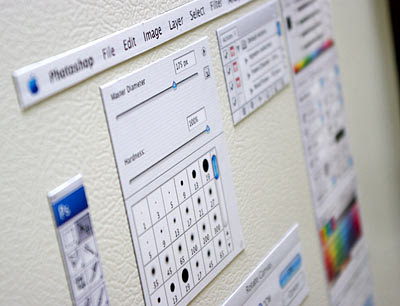
photoshop magnet

If you are one of those who thinks no photo is complete without going through Photoshop, then this magnets are for you, you can easily place any photo or postcard your friends send you onto your fridge with the confidence you would be able to support it properly with Photoshop.

:)

Blog Widget by LinkWithin