Sometimes the best surprises come in little packages. To coincide with its 20th birthday, Compagnie de Provence has added a substantial 180g version of its iconic vegetable soaps to the ranks.
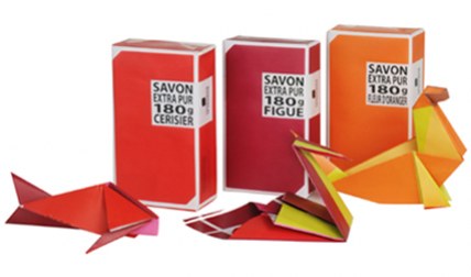
Each bar, made according to Marseille tradition from local natural ingredients, comes with a tiny instruction card so that once undone, its wrapper can be transformed into an ocean-inspired piece of origami.

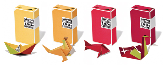
With eight fragrances to choose from, there's an entire menagerie waiting to be revealed, from swans to sea lions, and even a whale. Designed by Studio Plastac .
Monday, April 26, 2010
Origami soap packaging by La Compagnie de Provence
Saturday, April 24, 2010
The Future of Reading: Popular Science+ on Mag+
We love to read. We do it on-line, but we also love to hold the printed book or a magazine in our hands and flip through pages, smell the ink... As internet and new media devices develop and offer more engaged reading experience - as for example now new iPad, reading on-line becomes more and more attractive. True, you can't smell the ink (yet), but there are some projects at work which are making on-line reading (or reading on a device) more and more appealing. We have been writing already about digital magazines as seen by Mag+, and we've got an exciting letter from them - their fist Mag+ digital magazine is live: Popular Science+.
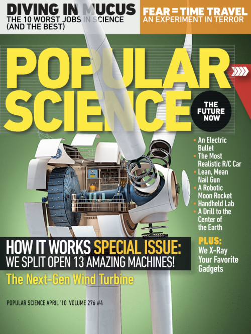
Mag+, Bonnier’s digital magazine platform, is a project that began months ago in a collaboration between Bonnier’s global R&D task force and BERG, a London-based design studio. It is now an ongoing project across all Bonnier titles in the U.S. and Europe to rethink the way magazines can be read on a new generation of full-color, touchscreen tablet devices. It’s been a fascinating journey with only 60 days available since Apple announced the iPad in San Francisco. They’ve had 6 editorial teams in 3 countries working together to re-imagine the form of magazines. The feedback from the Mag+ video was encouraging and since then they have been deconstructing tons of magazines, used more whiteboard space than any project before and building many many prototypes. They can be really proud of what they've have achieved together with the PopularScience+. And - without a doubt - there is a lot more to come.

Their design vision was to create a digital magazine, which should feel like if you are touching the actual magazine, using your natural body language – not looking through the screen and layers of buttons.
Popular Science +, the first digital magazine to emerge from Bonnier's Mag+, is a new way of experiencing magazines on digital devices and a first step toward our vision of what digital magazine reading can be. The Popular Science+ digital magazine features simple, fluid swiping motions let readers move horizontally through stories, while vertical scrolling allows them to read an article without interruption or distraction. In the app's unique Look mode, users can tap the screen to make the words disappear, highlighting the magazine's big, bold photos and illustrations. Another tap returns to Read mode.

The Bonnier Mag+ platform and the Popular Science+ magazine are based on 6 design principles:
1. Silent mode. Magazines are a luxury that readers can lose themselves in. Mag + has fewer distractions than the Web. It allows readers to lean back, away from the browser, and just focus on the bold images and rich storytelling. Reduced complexity increases a reader's immersion.
2. Fluid motion. Magazines are easy to browse, and Mag+ replicates that with a story-to-story navigation that's more like a panning camera than a flipping page. As we say, "Flow is the new flip."
3. Designed pages. Magazines are defined by their carefully conceived layouts that give readers an immediate understanding of the content and why it matters to them, a quality that got lost on magazine Web sites. Mag+ brings design back to digital publishing.
4. Defined beginning and end. Unlike the Web, magazines have a defined storyline and flow from front to back. Mag + returns to the notion that something can be, and wants to be, completed. It's the end of endlessness.
5. issue-based delivery. One of the great joys of magazines is that feeling of anticipation when a new one arrives. Mag+ maintains that by delivering full issues at once with all the same content as the print edition, and on the same schedule.
6. Advertising as content. Relevant, attractive advertising is as much a part of the magazine experience as the editorial content, and Bonnier wants Mag+ advertising to include both pin-ups and applications readers can appreciate.
Mag+ live with Popular Science+ from Bonnier on Vimeo.
Follow Bonnier and Mag+ here: www.bonnier.com/betalab, and check out Popular Science+ digital magazine on iTunes.
Thursday, April 22, 2010
No Sweat - Exercises for Gentlemen
The reprint of a century old fitness manual for working man "Exercises for Gentlemen. 50 Exercises to Do With Your Suit On." inspired a fashion shoot inside the headquarters of The New York Times. We love the photo shoot and idea, photos by Matthew Kristall.

About the book:
Laugh your way to a better you! For those too busy to go to the gym, try some of the fitness advice provided in this 1908 classic revisited. In today’s challenging business environment, the achieving executive needs every possible advantage, fitness included.
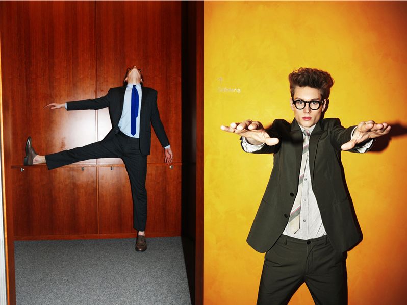
If gym fees and personal trainers do not fit into your schedule or budget, Exercises for Gentlemen offers just what the trainer would have ordered. With excerpts and original illustrations from The School of Health—the classic health reference of the early 1900s—here is a "practical course in physical culture" designed as a fitness program not even requiring a pair of exercise shorts, let alone joining a health club.
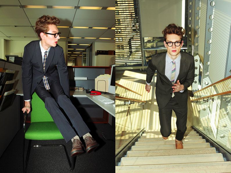
What results is both an entertaining glimpse of times gone by, and an exercise regime ideally suited to the modern man with neither the time nor the inclination to change clothes when he steps out from the busy office. This book contains detailed guidance on everything from knee bends and arm bends to proper posture, bathing, and homeopathic remedies—all to be taken with a suitable dose of humor.
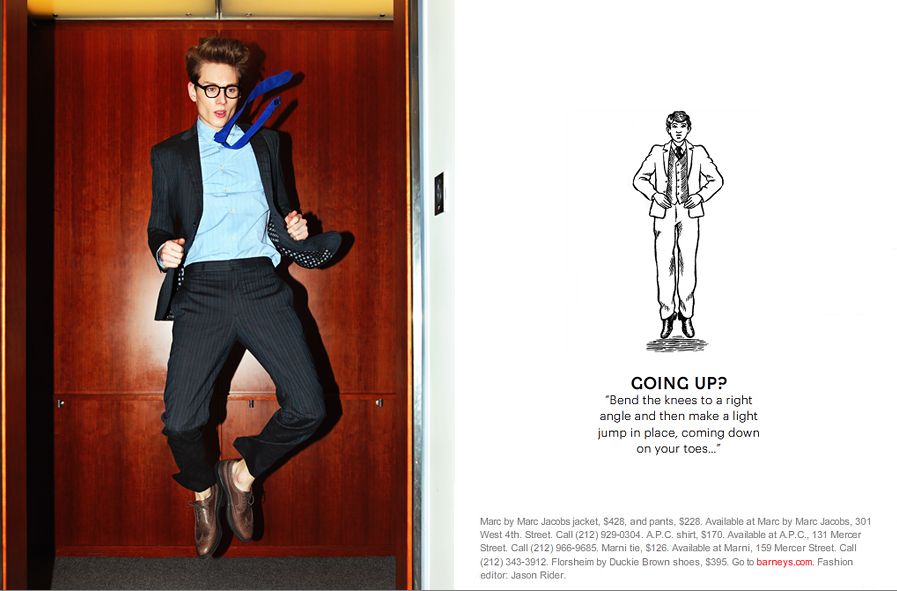
A daily regime of a mere fifteen minutes of be-suited exercise is guaranteed to "reduce undue fullness at the waist, square the shoulders, round out the arms, improve leg development, and, in short, make a more graceful, strong, and symmetrical man."
Thursday, April 15, 2010
Gone With the Wind
Milan is so hot right now! And we're in love with Nika Zupanc's newest collection Gone with the Wind, featured at Milan´s International Design Fair 2010 (Salone Internacionale del Mobile) as well.

Collection information by Nika:
This year’s edition of Superstudio Più will again be marked by the intriguing spirit of Nika Zupanc. With her exhibition Gone with the Wind, Nika Zupanc continues to be sincere while uncovering the excuses for a socially acceptable status quo.
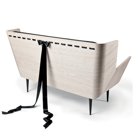
By positioning archetypes that are considered feminine in the carefully selected centers of public attention, her chillingly beautiful forms become emerging reference points. Her battles are of a higher style, and so the presence of famous female literary heroines remains mandatory.

The entry point to the world of Nika Zupanc – a frame for her gallery and a prism for readings of her work – is also a metaphorical structure. It is a tiny house driven by toy-like windmills on the outside and with a big bang of connota- tions from the inside.

The Wind Pavilion stands as an icon evoking a sense for nature. With it, Nika Zupanc embraces the issue of responsibility by introducing the elegance and poetry of creative expression into predominately technical solutions.
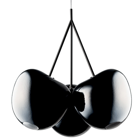
Like so many magic pavilions in the past, this one is also outfitted in one of the latest wonders of the industry – the unique modular façade system Qbiss by trimo. Optically smooth surfaces, unique rounded corner elements, and “shadow joints” allow great freedom of expression and enable an optically enchanting combination of an inclined grid and an attractive landscape of 45 restless windmills.
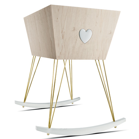
Inside the Wind Pavilion Nika Zupanc put her newest family of objects on display. This time they came to address you as advocates of a sort because they present a case for new symbolic and emotional readings of design, and are told through elements of modesty and self-reliance.

Instant fave!
You can see more on Salone 2010 on Dezeen.
Monday, April 12, 2010
We Are All Animals
We received an email by SLip, a french artist working on collage and cyanotype technic especially on his collection W3A - We Are All Animals. We liked the idea (and final result) and are happy to share it with you.
"The XXth century was particularly rich in incredible events and people became famous of numerous manners. However, far from the excitement of the big events of this world, the life continued and John Doe’s everyday life could show itself exciting.
This wealth and this variety supplied the bases of the reflection of SLip for this series of pictures where animals take our place to describe the nonsense of the world in which we live.
By the grace of the cyanotype, a primitive technique forerunner of the photography, mixed to the most modern techniques of digital cut, SLip suggests returning in the time and confiding again through animals."
This collection is constituted by 20 unique editions in the size of 14,8 x 21 cms printed on paper of extra-strong art 340g.
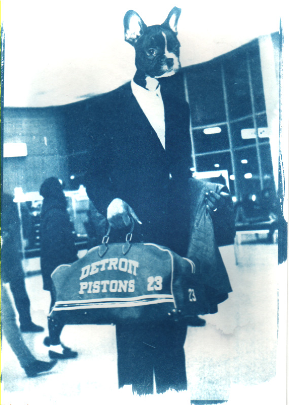
#2
Sergi Fuentes is the first Spanish to join the deceased ABA (Animal Basketball Association) in 1967. At the end of a summer of love which will stay in annals, he joins Detroit and his Pistons. During its first match, the mascot of the team annoys him accidentally just like that with piston. He will remain weak light for life.
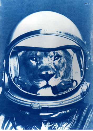
#9
In 1986, Leon Grellutch became the first Belgian astronaut. Unfortunately, the trip sponsored by Jupiler will never see the day and Leon will land forever. He’s always visiting Belgian universities to give lectures about life on Mars.
Sunday, April 4, 2010
Happy Easter!
Hello everyone! Happy Easter! We've been pretty busy lately (Thank You), that's why so little words from us. But today we'd like to share with you our latest assignment, a photo shoot at The Easter Champagne Brunch at Capella Pedregal Hotel & Resort.
I hope you enjoy it as much as we did taking pictures of it. Yummy! You can see the full photogallery in our photography library and store.

Easter Champagne Brunch as celebrated at Capella Pedregal Hotel & Resort, in Cabo San Lucas, Baja California Sur. The Easter brunch was offering inclusive Taittinger Champagne and Bloody Marys. Don Manuel's restaurant's Su Cocina was serving breakfast items, combination salads, seafood selections, traditional roasts and accompaniments, Continental Charcuterie and cheeses, Mexican specialties and a tempting choice of desserts.
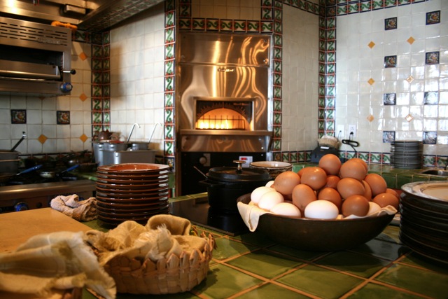

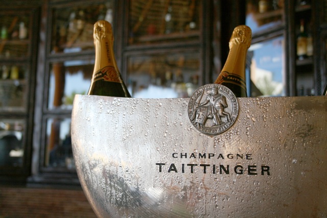
Easter Champagne Brunch at Capella Pedregal - Images by Romana Lilic @LA76


