Our friends from
a10studio, with offices in Cabo San Lucas and Mexico City, has sent us an exciting news about their recent work. It's a project they did for The Museum of Agriculture in Culiacán, Sinaloa, Mexico.
Agricultural production is one of the most internationally recognized emblems of Mexico, and particularly of the State of Sinaloa. The state of Sinaloa is known as the
"granary of Mexico" because it is the producer of a big variety of food. Its efficient fields have become national leaders in their yields.
Because the economy of Sinaloa is sustained by its agricultural activities, the project seeks to recognize it and promote it, through a work that displays objects related to branches of technology, history of agriculture and agronomy as well as agricultural ways which sustain the economy of Sinaloa. Through the creation of the Museum of Agriculture the city government tries to allow the public to learn more about the forms of production in the locality, while recognizing both the agricultural practice as such, and those who make possible such a noble activity.

Project Brief
Intro:
Through agriculture, man has colonized the territory for centuries, creating irrigation systems and by planting with geometric laws. He has de-naturalized the natural areas through the planting of natural elements; the distance that is between the planted trees or plants depends on both the size of the crop itself as the collection systems used. Each plantation produces a texture and color over the territory.

Agriculture industrializes, the landscape urbanizes.
a10studio proposal's
outside is as important as the inside. There are no objects and an external reality, but a continuum between forms that wrap and un-wrap, that close and open, that focus and serve as a focus. The architecture as this, expanded in reality, in the middle, through the environment, is an extension. The environment in which it appears is a field.
They present 3 key strategies for the development of the project:
_Operative Topographies
_Ecomonumentality
_Active Ecology
The spectacle of nature and city become now comparable.

_OPERATIVE TOPOGRAPHIES:
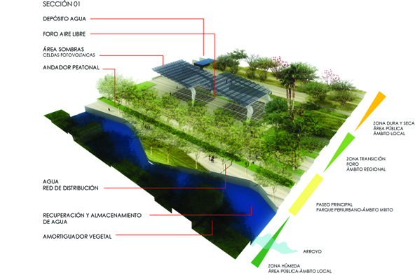
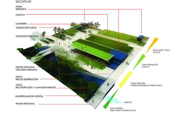
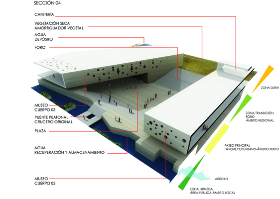
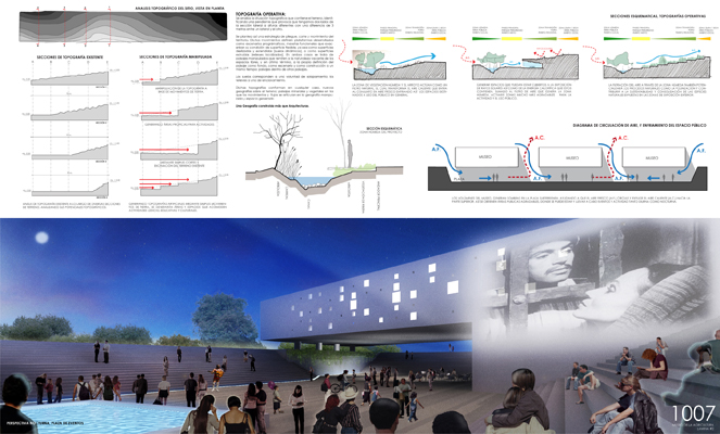
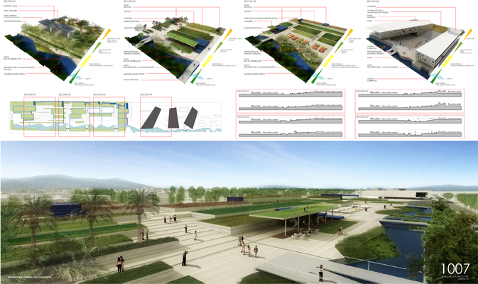
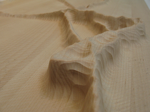
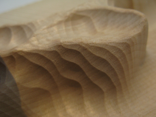
Based on the topographic analysis of the site, we suggests a strategy of folding, cutting and movement of the territory. Such movements define platforms developed as programmatic scenarios, functional plateaus exacerbating their flexible surface condition, either as slipped and extended surfaces [dynamic soil], or as extruded surfaces [located reliefs]. In both cases it is manipulated landscapes that refer to the nature of vacant spaces, and ultimately, the very definition of landscape as a background, as construction and stage at the same time: landscapes within landscapes.
The ground respond to a willingness to overlap, the reliefs to an interlock.
These topographies form in any case, new geographies on the ground; mineral and vegetal landscapes in which the movements and flows are articulated by a manipulated geography and a generated space.

_ECOMONUMENTALITY:
We are used to think of architecture in function of the place, meaning that it could find the keys with which to tackle the project. There are many ways to anchor to the site. The whole place has gone from being understood as a landscape, whether natural or artificial, and it has ceased to be the neutral ground on which man-made architectural objects stand out, to become the object of primary interest and focus of attention. Thus, changing the point of view, the landscape loses its momentum and becomes an object of possible transformations, both at the architectural level, neighborhood and city-level.
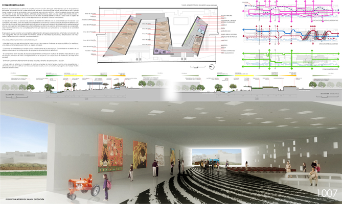
The architecture starts a process of artificial blurring with an obvious interest in incorporating a natural condition, both in terms of composition as constructive (proposed construction system of rammed earth walls, to emphasize the use of existing assets in the site as well as develop strategies for sustainability and passive ecotechniques), in search for environmental sensitivity and a formal complexity that responds precisely to the values of the Culiacan society.
The project seeks to build a complete redefinition of the place, offering primarily the invention of a topography. So with this double movement, from the nature to the project and from the project to nature, we seek to rescue a "ecomonumental” condition.
 An architectural proposal characterized by:
- Address both what is between things as things in themselves: public space [a hall, a plaza, a terrace] is therefore the primary object.
- The identification of the variability, the change as a key ingredient of architecture. With emphasis on the design of objects rather than the definition of definitive architectural programs.
- The commitment between scales. The project its determined and affects many areas beyond those granted by reason of mere physical contiguity. A project with translation capability, traveling between scales.
- Understand and feel simultaneously different scales and fields of perception and action.
- Acting on the near, immediate, tactile, and understand at the same time many other receptacles and dimensions that get modified with user actions, it is a flexible work program for the upcoming years.

_ACTIVE ECOLOGY:
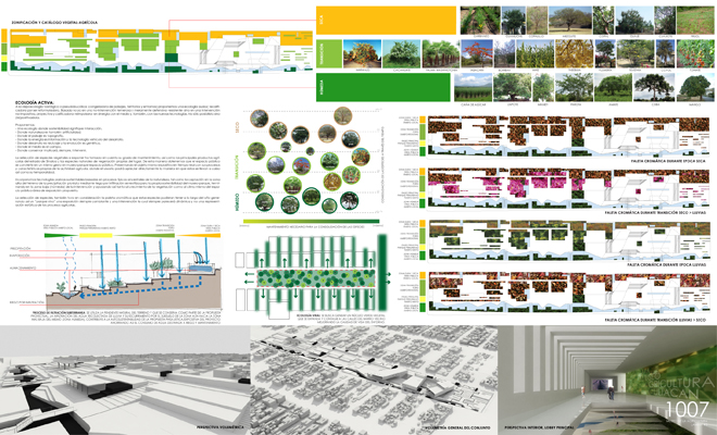
To the old nostalgic or pseudobucolic ecology (freezing landscapes, territories and environments) we propose a bold ecology; reclassified to be reformulated. Based not in a fearful and non-intervention purely defensive -resistant- but in a no-tax, projective and rating -(re)promotive- intervention in synergy with the environment and also with new technologies. Not only possibilities but (re)positivist.
a10studio proposes:
- An ecology where sustainability means interaction.
- Where Nature is is also artificiality.
- Where the landscape is topography.
- Where energy is information and technology the vehicle to development.
- Where development is recycling and evolution is genetic.
- Where environment is the field.
Where retain involve always intervene.
The selection of vegetal species to exhibit took into account the degree of maintenance as well as the main agricultural products of the state of Sinaloa and the natural species of native vegetation. In this way we achieve that public space becomes in a same gesture an inside museum-park-public space. Presenting the exhibiting object in real time with their processes and characteristics of agricultural activity, where the user can directly see how these are conducted and its temporality. Species selection also took into consideration the color palette that these species may have throughout the year generating a "living park" an ever-changing exhibition and intervention which always seem dynamic and not static representation of agricultural processes.

PROJECT DATA:
architectural project: a10studio +
lab07
project team: Mariano Arias-Diez, Luis Alarcón, Carlos Marín, Hugo Sánchez, Mia Modak
type: institutional, museum and park
location: Culiacan, Sinaloa (Mexico)
area: 45,000 m2
project year: 2010
client: Instituto Municipal de Planeacion (IMPLAN) de Culiacan
status: Competition finalist

CONSULTANTS:
landscape architecture: Hugo Sánchez / ENTORNO taller de paisaje
structural engineer: Ing. Fernando Alvarez / Construcciones FASA
rendering and digital visualization: Carlos Marín / lab07
lighting design: a10studio
contact a10studio:
_Sierra Guadarrama 85-1, Col. Lomas de Chapultepec, Mexico .D.F 11000, Mexico
_Isla Santa Catarina, Cabo San Lucas, B.C.S., Mexico
tel. +(55)26.23.26.73, +(624)13.15.14.7
email:
info@a10studio.net
web:
http://www.a10studio.net
Check out the story boards. We love how the thought has been put to every single detail:


 Congratulations!
