
we checked this past weekend some nice packaging:
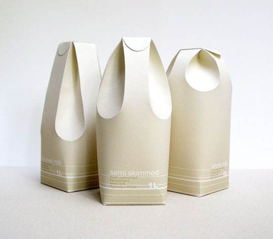
Designed by Raw Edges | Country: United Kingdom
An excellent example of structural package design applied in a functional and communicative way.
“These three different milk cartons distinguish between the rates of fat in the milk by using form rather than colour. The form of the milk cartons reflects in a way on the milk’s texture and smoothness. The two back folds are used as the carton’s handle, while the two in the front function as the spout.”
---
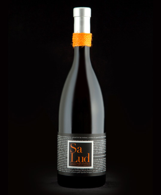
Designed by Spavilla Designs | Country: Spain
“Health is the promotional wine from Spavilla Designs. An elaborate packaging for this limited edition, which the prestigious Robert Parker has given a rating of 93 points.”
---
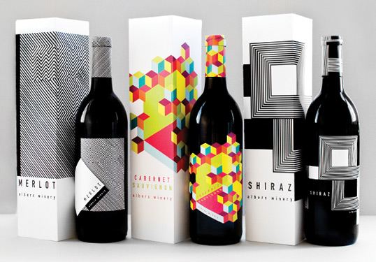
Designed by Meeta Panesar | Country: United States
“The design is inspired by the colors and designs of Joseph Albers and the Op Art movement. The usage of the rectangular elements reflects Alber’s “Homage to the Square,” a series of paintings begun in 1949.”
---
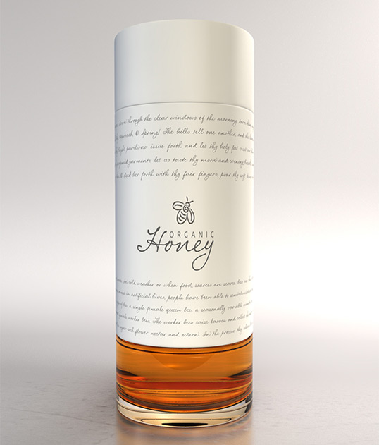
Designed by Marcel Buerkle | Country: South Africa
This elegant, copy driven packaging concept is the work of South African based designer Marcel Buerkle. The shape and cleanliness of the design almost gives it a bit of a high end perfume look and feel.
---
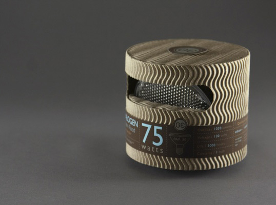
Designed by Mongkol Praneenit | Country: United States
“This is a redesigned for General Electric high-end light bulbs. The package is designed with recycled material to promote sustainability. Information is cleanly organized into a label system to reduce printing over the whole package.”
---
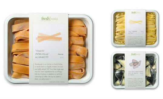
Designed by P&W | Country: United Kingdom
“The brief: Packaging for a company producing high end, handmade fresh pasta. The solution: We created fine art style prints of the pasta shapes, each one signed by ‘the artist’. The result: Improved sales and increased listings with no advertising support.”
---
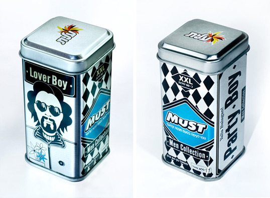
Designed by Oi Design Studio | Country: Israel
“The Brief: When The Strauss group fixed the intention of launching a series of consumer products aimed at men, they requested that we devise a marketing concept for the new products of ‘MUST’, starting with the packaging that will project a strong difference from competitors products on the shelf.
The Solution: ‘Must - Men Collection’ - chewing gum for men only. We chose a collection of illustrated Presenters: male types that we all know and admire - go-getters, women love these men and boys copy them. We put them on metal containers which are especially masculine and gave to each presenter a stage for his male life philosophies.”
---
all via lovelypackage.com
Sunday, January 31, 2010
weekend visual fix


Friday, January 29, 2010
Coal Furniture
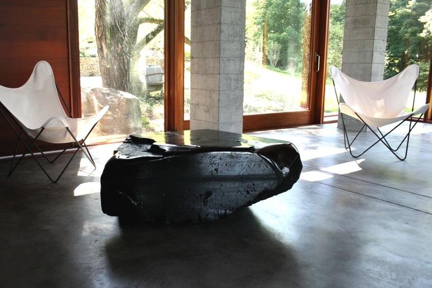
For the past decade, Jim Zivic’s medium has been coal, which he sculptures, hones and polishes into massive tables for clients like Lou Reed and Salma Hayek. “It’s a little romance with the muck,” the designer says of the anthracite chunks, which he buys 14 tons at a time from a mine in Pennsylvania and stores in the backyard of his upstate New York house.
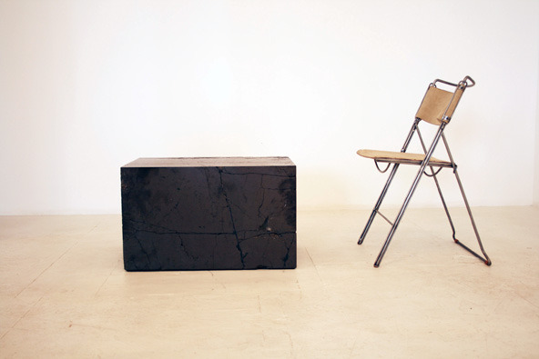
The coal’s earthiness appeals to Zivic, but the irony of his situation doesn’t escape him. “The same stuff my neighbors are burning for heat, Ralph is selling for thousands of dollars,” he says, referring to Ralph Pucci, the owner of Ralph Pucci International, the company that is known for its fashion mannequins and its furniture by cutting-edge designers.
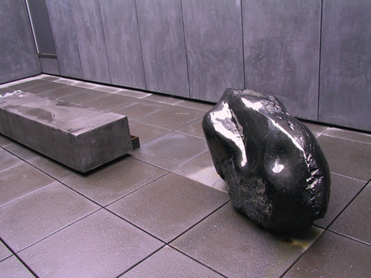
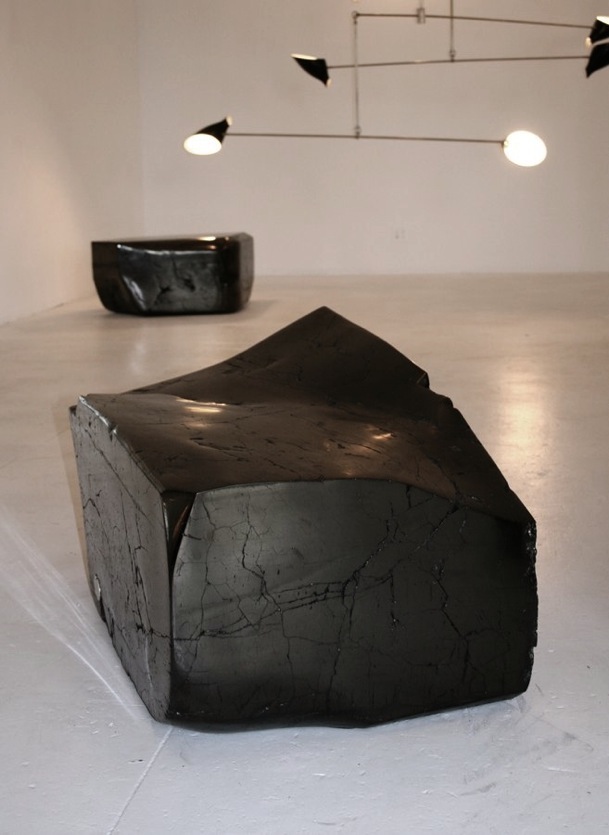
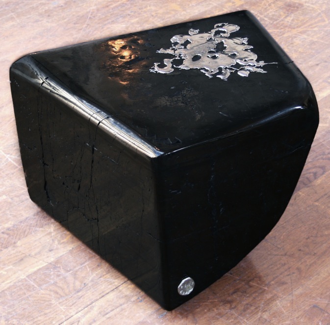
Jim Zivic's Coal Tables are carved from anthracite coal (100% pure carbon, not to be confused with charcoal). Each piece of raw coal is unique in shape, and the designer allows this to dictate the final silhouette of the table. The piece maybe shaped organically, or cut into more geometric linear lines.

Sunday, January 24, 2010
Dot. Dot. Polka dot.

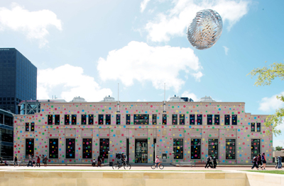
Polka dots are back in 'fashion'. Not that they were ever out. While polka dots are ancient, they first became common on clothing in the late nineteenth century in Britain. At the same time polka music was extremely popular and the name was also applied to the pattern, despite no real connection between them. The polka dot also appears in popular music. Remember "Itsy Bitsy Teenie Weenie Yellow Polka Dot Bikini" by Brian Hyland? Before that however, "Polka Dots and Moonbeams" was Frank Sinatra's first hit recorded with the Tommy Dorsey Orchestra, published in 1940.
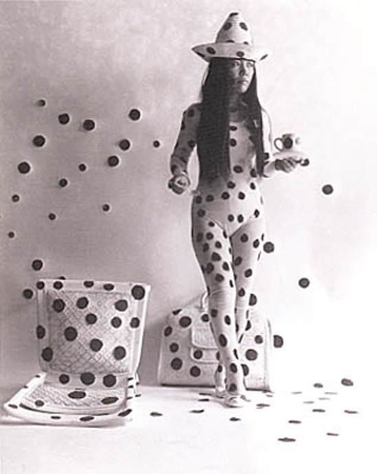
Polka dots have been also the 'thing' that marked the life and work by Yayoi Kusama, japanese avantgarde artist that suffered since childhood from hallucinations and started to cover surfaces with the polka dots. There was a time when she was as well-known as Andy Warhol among admirers of Pop Art. Acknowledged as a progenitor of Minimalism, Kusama made headlines for street performances in which she painted polka dots on nude men and women. But Kusama was largely forgotten by the art world after she returned to Japan in 1973, suffering from obsessive-compulsive disorder. She was committed to a mental institution, where she remains to this day.

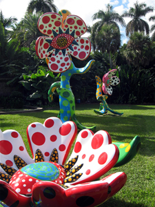
Kusama’s neglect by art history has been redressed in a traveling retrospective of her seminal 1960s work. When the retrospective was on view in New York’s Museum of Modern Art, shock waves of recognition went through the art world. Lately, her work has been traveling around the world and you can see her work here: Matsumoto City Museum of Art, Nagano, Japan; CITY GALLERY WELLINGTON, New Zealand; Padiglione d'Arte Contemporanea, Milan; Fairchild Tropical Botanic Garden, Miami; and The National Museum of Art, Osaka.
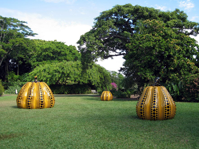
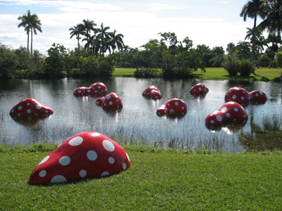

She also collaborated with Japanese mobile provider iida and created a limited art edition mobile phone.

Monday, January 18, 2010
First Spring; a movie by Prada + Yang Fudong

Inspired by the Chinese adage that "the whole year's work depends on a good start in spring", this bold and beautiful film (9,17 mins) represents an exciting new direction for Prada's visual communications at the start of this decade.
Featuring young men gathered in Shanghai, dressed in Prada menswear, the black and white film portrays a timeless, dreamlike realm where anything is possible.
"First Spring" is Prada's latest collaboration with pioneering Chinese artist Yang Fudong.
Picture in the movie is subtle and sublime, quiet but meaningful:


Saturday, January 16, 2010
Wallpaper* Design Awards 2010
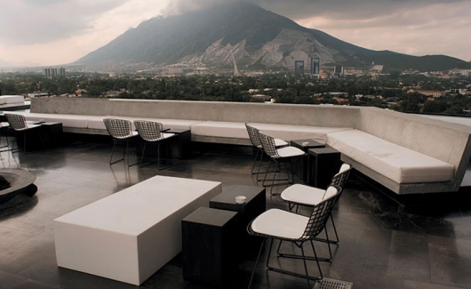
Wallpaper* just published the winners of their 2010 Design Awards. Entries come from every possible part of the design field, from architecture to fashion design to industrial design, and were awarded in 66 respective categories. A panel of judges, including icons like architect Steven Holl, fashion designer John Galliano, and interior designer Kelly Wearstler, then picked the winners for eleven key awards.
In the category “Best New Private House”, Marcio Kogan’s Paraty House in Costa Verde, Brazil was awarded as winner, and “Best New Public Building” is Koncerthuset in Copenhagen, Denmark by Atelier Jean Nouvel, as also in the Best New Hotel category the award was for Habita MTY by Joseph Dirand and Landa Arquitectos (shown above).
“Best City” this year is - surprise, surprise! - New York whose High Line project was also awarded “Best Life-Enhancer of the Year”.
Here’s a selection of lucky 2010 Design Awards winners (for the complete list of winners please go to Wallpaper.com):
Best City: New York (Video: “City short: New York” by David Usui)

Life-enhancer of the year: The High Line, by Friends of the High Line, James Corner Field Operations and Diller Scofido + Renfro

Best new private house: Paraty House, Costa Verde, Brazil, by Marcio Kogan
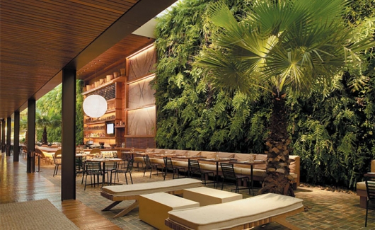
Best new restaurant: Kaa, Sao Paulo, Brazil, by Studio Arthur Casas
as seen on BUSTLER
Subscribe to:
Posts (Atom)


 Posts
Posts


