Monday, June 29, 2009

Advertising Tres Chic!

Viva the days when advertising is not only about supersizing everything and anything, but when you actually enjoy seeing the ad or actually a short film. Where creativity has no limits and where the usual rule "make the logo bigger" doesn't apply.

This advertising creations came to me as a hint from my friend in Slovenia, and it made my day.
"Ah, le cinema! Remember the days when men were strong and silent, women were chic and sophistiqué, and the action was as smooth as our 4% triple filtered beer?" Asks Stella Artois at their website Smooth Originals.

At Stella Artois, they have gone back in time to rediscover these films – the originals, before Hollywood did to them what Hollywood, sadly, does (what a truth).
Vive le cinéma triple filter!

I hope you enjoy these as we did:
8 Kilomètres

See the movie here.

Dial Hard

See the movie here.

Vingt-Quatre Heures

See the movie here.

Genial!

Sunday, June 28, 2009

Excuses to drink (more) wine

For those needing an excuse to drink more wine....

what about to include kitchen renovation into your excuses for drinking wine?


R3 project by Petz Scholtus

Thursday, June 25, 2009

your own collab with Joshua Davis

Here at LA76 are big fans of Joshua Davis for several different reasons. His work as an early Flash pioneer with Praystation and he was a one of the first people to release their Flash code as open source so everyone could learn and grow from what he was doing. Some people say is great to see him speak live (we haven't got the chance) because of his energy and that fantastic fight between jet lag and Red Bull for control of his brain (here talking at OFFF Portugal).

We not only love the look but because of play between the left brain/right brain intersection that happen when you bring art, technology and interactive together like this.

This week he took his art into a new direction with the launch of the
Reflect iPhone application.
You start in Designer mode where you can choose one of his six distinct visual systems and one of ten color palettes. Then it gets really interesting because you collaborate with the application to create the final work of art.You draw on the canvas to control where symbols are placed but the application uses dynamic abstraction to select the symbols and colors so each piece is always unique. This is the type of left brain/right brain intersection we love. When you are happy with you creation you can save it to your photo gallery for various uses or put in into the Kaleidoscope view within the application.


Tuesday, June 23, 2009

bye bye Kodak moments

Eastman Kodak Company announced yesterday that it will stop manufacturing and marketing of the Kodachrome, the first color film of commercial success and one of the most appreciated by professional photographers.

At 74 years the Kodachrome succumbs to the advancement of digital photography and other advanced art film, which have brought down the sales of these slides and make the process of developing more expensive. "Kodachrome is an icon. It was a difficult decision, given their great history, but most photographers today's bid to take pictures with newer technologies, both digital and with other films," said president the division of Kodak film, Mary Jane Helly, in a statement.

At the current pace of sales, the manufacturer estimates that the rolls of Kodachrome will disappear from the shelves around the world at the beginning of autumn in the northern hemisphere. Some of the last reels will be donated to the International Museum of Photography and Film, George Eastman House in Rochester (New York), where the world's largest collection of cameras and related articles is.

Moreover, it is anticipated that the photographer Steve McCurry, known for his photograph of the Afghan girl (Sharbat Gula)with green eyes who in 1985 was front page of National Geographic magazine, shoot some of the last reels, after which the slides will be displayed in the New York museum. "The first stage of my career was dominated by films and with Kodachrome i did some of my most memorable photographs," McCurry said in a statement, which acknowledged that after 17 years, he returned to photograph the woman and no longer did it with this kind of film.


Kodak has also created a space on the internet to pay tribute to this type of film, the oldest in the market and one of the most recognized and valued by professionals among other reasons due to the sharpness and duration of its colors. Kodachrome has also been name of one of the popular songs by Paul Simon and also name to a spectacular national park in Utah.


However, it does not involve either a 1% of sales of Kodak film, which in recent years has undertaken a major restructuring of its business to focus on the digital world. This past January, the firm announced plans to cut between 3,500 and 4,500 jobs, although it closed 2008 with a profit of 339 million dollars (287.6 million euros).

70% of its revenue comes from the digital market and, according to Kodak, there is only one laboratory left in the world which develops this type of slides, the Parsons Dwayne's Photo in Kansas (United States), due to the complexity of the process. After this news and half session at the New York Stock Exchange, the securities fell by 7% and is trading at about $ 2.65, at a time when the major stock indicators lost more than 2%.

Sunday, June 21, 2009

The world is Starck's Oyster

Philippe Starck never entertains on the half shell.

Keeping up with the Starcks is nearly impossible: not at work, and certainly not at play. Even when the design superstar Philippe and his wife, Jasmine, unplug, as they do every July at their house near Cap Ferret, France (June is spent on the Venetian island of Burano; August is Formentera), the tiny cabanas surrounding their modest home are filled with friends and family, who gather at the seaside table for an ad hoc lunch that lasts until well after the lights strung in the fig trees have been switched on.

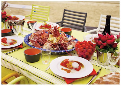
One afternoon last summer, the Spanish chef José Andrés was tackling lobsters at the kitchen island, Andrés transformed oyster liquor into pliant balls for a ‘‘simple’’ cubist appetizer of watermelon, tomato and oyster. It was an off-the-cuff creation, made after a morning market run and an impromptu delivery from Starck’s neighbor Joël, a fifth-generation oysterman. (Starck has been trying to cultivate square oysters in the bay for 15 years. Harvest to date: 12.)

Andrés, known for the playful, smart, international food that he serves at his seven restaurants in Washington, D.C., is a good foil for Starck, who had a lot to celebrate that afternoon: the minting of his designs for a 2 euro coin, a motorcycle, a mega-yacht, a hotel and loudspeakers, among many other projects. Like the afternoon meal they assembled out of thin air — including gazpacho, a rustic Galician dish of lobster and potatoes doused with olive oil and pimentón, and an over-the-top trolley laden with kilos of Ibérico ham and Parmesan — Starck and Andrés have a stylish ease together that leaves plenty of room for spontaneity.


The wood-frame house has a similar effortlessness. Filled with a mixture of Ikea and Starck — a gun lamp here, a hotel-lounge-size sofa there — the walls are covered with photos from the couple’s October 2007 engagement party as well as maritime kitsch, right down to a singing fish. ‘‘It’s a house for living, pas une maison chic,’’ said Jasmine, who worked as a global press attaché for Louis Vuitton and is now director of communications for her husband. (‘‘He has a lot of potential,’’ she says with a laugh.) Hence there are plenty of bicycles outside for guests, as well as rubber wading boots in dozens of sizes.

If visitors are thirsty at breakfast, there are restaurant-style orange-juicing and granita machines next to a table out front. If they’re thirsty in the afternoon, the pantry features cubbies labeled ‘‘White Wine,’’ ‘‘Red Wine’’ and ‘‘Champagne Bio,’’ filled with Starck’s own brand of organic bubbly, a bottle of which had just been popped. A Rod Stewart song came on the stereo and, out of nowhere, Philippe scooped up Jasmine for a raucous dance and serenade, followed by a toast to ‘‘l’amour, la nuit et le jour.’’The toasting and dancing extended to the table, where the hosts were joined by Philippe’s 31-year-old artist daughter, Ara; Theresa Fatino, the creative director of SBE, which owns the SLSHotel; and her husband, Greg Stanton.

Starck handed his house Champagne cocktail to Andrés, who noted, ‘‘You can buy the sunglasses, you can buy the chair, but you can’t buy the drink, made by Starck.’’ The designer quipped back, ‘‘Darling, you make good food. Me, my only talent is to make things fast and fun.’’ They all drank to that.


*Photographs by Sofia Sanchez and Mauro Mongiello
original article by Christine Muhlke for the T.Magazine

A Hacienda for a Russian Inmigrant


A Hacienda in the New York sky for a Russian Inmigrant

“I was looking for my own identity. I wanted something more rough-edged, a place where I could throw bold colors onto the wall and didn’t have to walk carefully.” Boris Fishman says.


...At Oaxaca “I was standing in the central plaza, listening to the bells from the cathedral,” Mr. Fishman recalled. “Shops were open; teenagers were hanging around, flirting; families were strolling about. The idea of evenings devoted to leisure and conversation, brass bands playing spontaneously, women dancing on the cobblestone streets — I felt connected to it because it felt so European.”

He was reminded of Minsk, the city in Belarus where he had spent his childhood. Six months and $15,000 later, he had produced a series of spaces that captured the look and especially the vitality of semitropical places in Mexico, albeit within the unlikely setting of a drab high-rise.

The showstopper, drawn with a felt-tipped marker on a living room wall, is a menu from a favorite restaurant in Xalapa, featuring such items as “enchiladas de la casa (4) MX $47” and “tostadas de pollo (3) MX $42.” To the right are black and white photographs of Guatemalan refugees in Mexico, surrounded by frames hand-painted on the wall and reminiscent of displays found in restaurants in Mexican university towns, where work by a local artist is invariably found on the wall next to the menu.

Read the whole article via de NYT
clicking here

Or watch a "audio slideshow"
here

Friday, June 19, 2009

a10studio

Very few times we post about our work, in this occasion we will show a bit of the whole image that we had developed for our buddies at a10studio, we are developing our own full website for LA76 and soon you will be able to see more samples of our work there, meanwhile, here's the logo we did as part of the whole image concept for a10studio:

We are also in charge of their website, so check it out, pretty cool young architecture office: www.a10studio.net

have a nice weekend!

Wednesday, June 17, 2009

The mexican Metaphors of Graciela Iturbide

In the history of mexican photography, Manuel Álvarez-Bravo is God and Graciela Iturbide the Holly Spirit.The rich imagination of his work is full of gardens filled with cactus, pedestrians walking aimlessly, one piece women portraits. It is a blend of ancient traditions and the struggle for daily survival. The allegations are not violent. Graciela Iturbide (Mexico, 1946) has chosen all his life for the metaphors to awaken a critical sense of the spectator.

She wanted to be a writer first and a filmmaker later. She entered the School of Film in Mexico City and filmed two movies before succumbing to the great myth of Latin American photography, Manuel Alvarez Bravo. From him she learned to give things the time they need. "There is no hurry. There is no hurry," was the slogan that the teacher had in his laboratory and Graciela learned to apply in their work and, above all in his life. "At a time when it was not very well seen, i went camera in hand all over Mexico. And I knew and portrait archaeological beauties, its celebrations of the death, the determination of the women at the Sonora desert and the botanical gardens whose beauty is so impressive as its fragility."

Graciela Iturbide is still in full swing, portraying everything that continues to call her attention. However, always with analog camera and a developing and editing process which suit to the author. She doesn't understand her work in other ways.

"The camera was always an excuse for me to understand the world and cultures. I like to find myself with things that fill me with adrenaline and when I come back to the lab i experience again the surprise of the picture," says Iturbide. "Sometimes, as "woman angel" [one of his most famous works, in which a woman crosses the desert dragging a transistor], I was never conscious of having done that work. I saw it in the lab."

The Fundación Mapfre opens to the public today, the first major anthology in Spain to be devoted to the Mexican artist, considered one of the largest in the history of photography. The Madrid exhibition is a walk thru her best known work and also her most recent work.

The surprise gift of the exhibition space is devoted to pictures of what was once the bathroom of Frida Khalo, closed since her death in 1954: the orthopedic corsets and shoes, lots of drugs, the orthopedic auxiliary bars... Iturbide masterfully reconstructs the threatening atmosphere in which the painter lived; kind of the same threat that hangs over the world of Iturbide.


Tuesday, June 16, 2009

Pureness, Beauty and Simplicity - Ballet at Vaganova

The Vaganova Ballet Academy is one of the most famous and influential classical ballet schools in the world. It has been training students in classical ballet for almost 300 years.

I am not a ballerina, although in our old days of communism in Yugoslavia me and my friends were faithfully attending classes of rhytmic gymnastics, wearing soft slippers and black tricos, trying to pursue elegance & balance and lots of elasticity. No, I am not a ballerina, although I wished I was when I saw following images... My visual & emotional fix of the day... This is for you Alma & your mom...


You might also like this slide show at NY Times and/or this video.

The school was established as the Imperial Theatre School by decree of the Empress Anna on 4 May 1738 with the French Ballet Master Jean-Baptiste Lande as its director. The first classes occupied empty rooms in the Winter Palace in St Petersburg and the first students were twelve boys and twelve girls. The purpose of the school was to form Russia's first professional dance company, which lead to the formation of the Imperial Russian Ballet, the school becoming known as the Imperial Ballet School. The Imperial Russian Ballet is the direct predecessor of today's Mariinsky Ballet, which remains one of the worlds leading ballet companies to this day, with the Vaganova Academy as its associate school. Established in 1738, the academy is based in St. Petersburg, Russia and is named after the renowned pedagogue Agrippina Vaganova, who cultivated the method of classical ballet training that has been taught at the school since the late 1920s. Graduates of the school include some of the most famous ballet dancers, choreographers and teachers in history and many of the worlds leading ballet schools have adopted elements of the Vaganova method into their own training.
(thank you to Danny Q for the history of Vaganova)

Sunday, June 14, 2009

(the quest for) ORNAMENT

Chokkura plaza by Kengo Kuma and Associates

Although the debate about ORNAMENT in contemporary architecture and design is a bit more complex than what we will mention here, i wanted to share this combination of works by different offices plus an extract of a text by Oliver Domeisen included in DETAIL magazine (nov-dec 2008). Hope you like it and makes u start thinking about this concept in today's art, design and architecture fields:

There never actually may have been a singular notion of ornament. We have to understand that historically most concepts of ornament were circumscribed in times of crisis, which indelibly tainted their outlook.

urbnundrgrn by a10studio

New methods of digital manufacturing (CNC milling, laser cutting, robotic bricklaying, etc), finally allow for intricate and complex forms to be translated from digital modeling into built reality.

SUR pavillion (PS1), by xefirotarch

If we cast our eye over the architectural ornaments produced across diverse historical periods and geographical cultures, we can detect certain commonalities.
Ornament most commonly occurs in the margins and between things. There can either highlight or disguise a joint. At the same time, ornament serves as a frame, surrounding doors and windows, it negotiates between inside and outside or, as in a picture frame, between reality and fiction.

Tea & Coffee Towers for Alessi by Greg Lynn FORM

While ornament here acts as a form of containment, it also allows for the contained to connect to a variety of contextual elements, physically and symbolically. Ornament is always a method of translation; it can absorb anything from plants, human bodies and animal parts to militaria, geometric patterns, heraldry and text, and adapt them to the architectural idiom through material transubstantiation, chromatic rephrasing, rescaling or flattening.

Fleshless floring by commonwealth

Ornament often implies dynamic forces, such as movement or growth, that are not present in the tectonic make-up of a structure. These can appear expansive as in directional linear motifs and the radial expansion of surface ornament, or as intricate convulsions that determine the internal coherence of self-contained ornamental objects.

Beast Chaise lounge by Neri Oxman

Frequently, ornamental motifs are derived from nature precisely for that reason: to instill life into the inert matter of architecture by emulating nature's growth, balance and dynamism. Ornament is never "the real thing".

Maximilian's Schell by Ball-Nogues studio

The distribution of real objects for aesthetic purposes belongs to the realm of decoration, following the rules of "decorum" (fashion, propriety) rather than those of "ornamentum".

Leaf Chapel by KleynDytham

As an image of combination, ornamental transformations often result in the creation of hybrids, fantastical beasts and monsters, making ornament the home of metamorphosis, transgression and animation.

vousoir cloud by IwamotoScott

Ornament is not truth.


It favors mimesis, deception, illusion and, most important, pleasure and beauty, which render utility acceptable and entertain the eye as well as the mind.

vousoir cloud by IwamotoScott

Blog Widget by LinkWithin