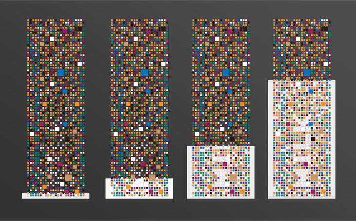
Serbian product designer Damjan Stankovic [relogik] present us CIPHER:
An empty glass resembles a meaningless colorful mosaic, until a liquid is poured into it, revealing its name. Each side of the glass is reserved for a specific drink. The Dekrypt glass though complex in appearance in fact runs on a very simple idea. Differently colored shapes are scattered across the glass surface in a seemingly random pattern, however their position is hardly accidental. The true purpose of the glass mosaic is revealed when colored liquid is poured into it (orange juice, milk, Nescafe or coke) The pattern of shapes and empty spaces on the glass combined with the color of the liquid inside the glass end up forming a textual sign, revealing what exact drink or refreshment you are having, with each side of the glass reserved for a specific drink. Besides being a novelty item with entertainment value it can also serve as a marketing item for beverage companies as it has a promotional potential.


No comments:
Post a Comment