Thursday, May 13, 2010

BETTER CITY, BETTER LIFE - Shanghai Expo 2010, UK Pavilion


We absolutely love the UK Pavilion at the Shanghai Expo 2010. Mastermind behind it is Heatherwick Studios, run by acclaimed architect Thomas Heatherwick.

The Pavilion's design seeks to engage meaningfully with the Expo's theme, "Better City, Better Life". It veers from the expected trend of digitally-driven pavilions and explores the relationship between nature and cities. The Pavilion is made up of two interlinked elements, the Seed Cathedral and a multilayered landscape covering 6,000 square meters.
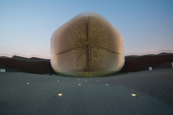


The cathedral itself is 20 meters high and is formed from 60,000 7.5 meter-long transparent fiber optic rods, which draw light into the interior by day and at night become illuminated via inside light sources. The rods, or "optic hairs," also sway in response to the wind to bring dynamism to the structure. The overall design riffs off the mission of London's Kew Garden Millennium Seedbank, which seeks to collect the seeds of 25% of the world's plant species by 2020. It sits on a multilayered landscape continues the cathedral's texture, covering 6,000 square meters. Made of a special artificial grass, it is intended to be a welcoming and restful space for Expo visitors.


Heatherwick Studios won the British Foreign & Commonwealth Office's commission to create the Pavilion, besting other top name competitors like Zaha Hadid Architects, John McAslan + Partners, Marks Barfield Architects, Avery Associates, and DRAW Architects with dcmstudios.


Shanghai Expo runs from May 1 to October 31, 2010. See also our article on EXPO 67.

See the video. It lasts 10 mins, but it's worth it!

Wednesday, May 12, 2010

Rock Me Baby


The summer has arrived to Baja California Sur. With an average of 86 F / 30 C in May there are several ways to enjoy your day. The best one (obviously) is at the beach... And the other, our personal favorite, is at your garden, on a hammock, with a nice easy drink (mojito, michelada, a glass of wine or a fresh lemonade...) reading your favorite book and listening to some nice tunes, like The Bird and The Bee.

Today we fell in love with this knotted hanging chair by Anthropologie .


See also a hanging chair from collection Garden of Eden by Ontwerpduo.

Thursday, May 6, 2010

Windcuts

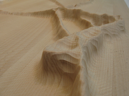
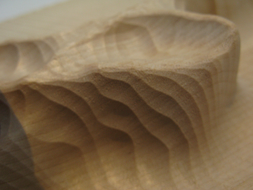
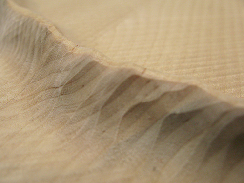
Windcuts [flickr.com] consists of various experiments that turn quantitative sensor data into visually compelling physical instantiations. Wind movement measurement data, such as wind direction, velocity and temperature, was used as the foundation to generate a 3D form, which was then physically drilled out of a piece of wood.

The direction of the physical line corresponds with the direction of the wind. The width and speed of movement reflects the wind speed. The temperature is mapped unto the height. The materials ‘surface plateau’ height represents zero degrees Celsius. So when the shape dips below the surface, it means the wind’s below zero degrees.


Images and articles first seen on el conTEXTO

Monday, April 26, 2010

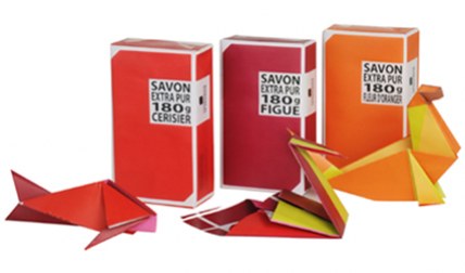
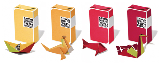
Origami soap packaging by La Compagnie de Provence

Sometimes the best surprises come in little packages. To coincide with its 20th birthday, Compagnie de Provence has added a substantial 180g version of its iconic vegetable soaps to the ranks.


Each bar, made according to Marseille tradition from local natural ingredients, comes with a tiny instruction card so that once undone, its wrapper can be transformed into an ocean-inspired piece of origami.


With eight fragrances to choose from, there's an entire menagerie waiting to be revealed, from swans to sea lions, and even a whale. Designed by Studio Plastac .

Saturday, April 24, 2010

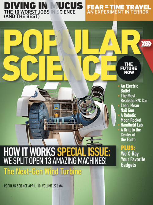
The Future of Reading: Popular Science+ on Mag+

We love to read. We do it on-line, but we also love to hold the printed book or a magazine in our hands and flip through pages, smell the ink... As internet and new media devices develop and offer more engaged reading experience - as for example now new iPad, reading on-line becomes more and more attractive. True, you can't smell the ink (yet), but there are some projects at work which are making on-line reading (or reading on a device) more and more appealing. We have been writing already about digital magazines as seen by Mag+, and we've got an exciting letter from them - their fist Mag+ digital magazine is live: Popular Science+.


Mag+, Bonnier’s digital magazine platform, is a project that began months ago in a collaboration between Bonnier’s global R&D task force and BERG, a London-based design studio. It is now an ongoing project across all Bonnier titles in the U.S. and Europe to rethink the way magazines can be read on a new generation of full-color, touchscreen tablet devices. It’s been a fascinating journey with only 60 days available since Apple announced the iPad in San Francisco. They’ve had 6 editorial teams in 3 countries working together to re-imagine the form of magazines. The feedback from the Mag+ video was encouraging and since then they have been deconstructing tons of magazines, used more whiteboard space than any project before and building many many prototypes. They can be really proud of what they've have achieved together with the PopularScience+. And - without a doubt - there is a lot more to come.


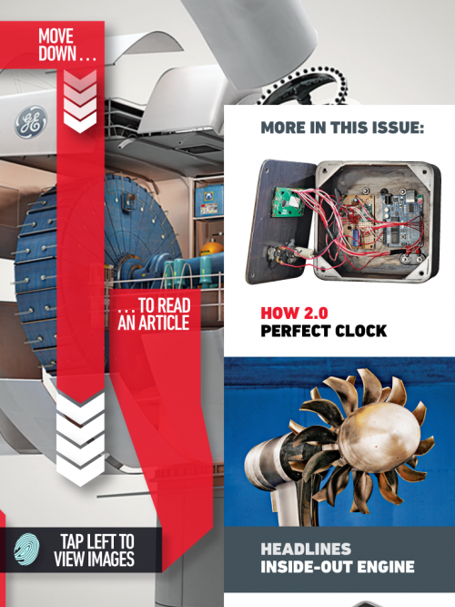
Their design vision was to create a digital magazine, which should feel like if you are touching the actual magazine, using your natural body language – not looking through the screen and layers of buttons.

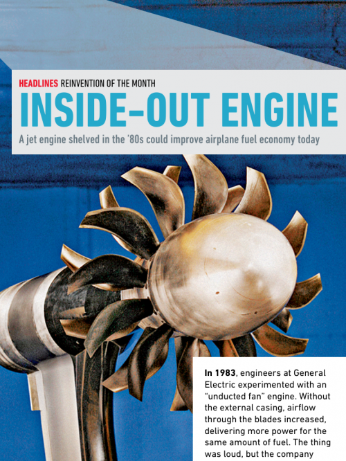
Popular Science +, the first digital magazine to emerge from Bonnier's Mag+, is a new way of experiencing magazines on digital devices and a first step toward our vision of what digital magazine reading can be. The Popular Science+ digital magazine features simple, fluid swiping motions let readers move horizontally through stories, while vertical scrolling allows them to read an article without interruption or distraction. In the app's unique Look mode, users can tap the screen to make the words disappear, highlighting the magazine's big, bold photos and illustrations. Another tap returns to Read mode.


The Bonnier Mag+ platform and the Popular Science+ magazine are based on 6 design principles:

1. Silent mode. Magazines are a luxury that readers can lose themselves in. Mag + has fewer distractions than the Web. It allows readers to lean back, away from the browser, and just focus on the bold images and rich storytelling. Reduced complexity increases a reader's immersion.
2. Fluid motion. Magazines are easy to browse, and Mag+ replicates that with a story-to-story navigation that's more like a panning camera than a flipping page. As we say, "Flow is the new flip."
3. Designed pages. Magazines are defined by their carefully conceived layouts that give readers an immediate understanding of the content and why it matters to them, a quality that got lost on magazine Web sites. Mag+ brings design back to digital publishing.
4. Defined beginning and end. Unlike the Web, magazines have a defined storyline and flow from front to back. Mag + returns to the notion that something can be, and wants to be, completed. It's the end of endlessness.
5. issue-based delivery. One of the great joys of magazines is that feeling of anticipation when a new one arrives. Mag+ maintains that by delivering full issues at once with all the same content as the print edition, and on the same schedule.
6. Advertising as content. Relevant, attractive advertising is as much a part of the magazine experience as the editorial content, and Bonnier wants Mag+ advertising to include both pin-ups and applications readers can appreciate.


Mag+ live with Popular Science+ from Bonnier on Vimeo.

Follow Bonnier and Mag+ here: www.bonnier.com/betalab, and check out Popular Science+ digital magazine on iTunes.

Blog Widget by LinkWithin